You are often faced with the decision of how to react to the variation in your process. Should you investigate for some specific root cause, or make fundamental changes? We will explain the use and benefits of a control chart, plus provide a few best practices for using them to monitor the variation in your processes.
Overview: What is a control chart?
A control chart, also known as a Shewhart or Process Behavior chart, is a time series graph of data collected over time. It is composed of a center line representing the average of the data being plotted and upper and lower control limits calculated from the data. The control limits represent the upper and lower expectations of the process variation.
The control chart was developed by Dr. Walter A. Shewhart while working at Bell Labs in the 1920s. Shewhart was aware that variation existed in the manufacturing processes and was concerned with how people reacted to that variation. He observed that continuously reacting and tampering with the process resulted in greater variation. Shewhart defined two sources of variation: common cause and special cause.
Common cause was defined as the random inherent variation in the process caused by the variation of the process elements. The proper reaction is not to seek a cause for the variation, but to make fundamental changes in the process elements. The source of special or assignable cause variation is an unexpected occurrence. The reaction for special cause variation is to investigate the reason and either eliminate the cause if it is detrimental to the process, or incorporate it if the process was improved.
On May 16, 1924, Shewhart wrote an internal memo introducing the concept of the control chart as a tool for distinguishing between the two causes of variation. Around that time, Shewhart’s work came to the attention of famed statistician Dr. W. Edwards Deming, who was working at the Hawthorne plant of Western Electric. Deming was a strong advocate of Shewhart’s thinking and helped spread the use of the control chart in industry.
Control charts can be used for both continuous and discrete data. While the format and calculations vary as a function of the type and amount of data, the core concepts and purpose are the same. Some of the more common control charts are the Xbar and R chart, ImR chart, P and Np charts, and C and U charts.
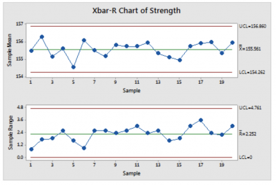
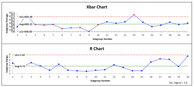
Data for the control chart can be selected randomly or over a specified time period. It can be collected as single data points or rational subgroups of data. Below is an example of an Xbar and R chart showing the center line and control limits.
If all the points fall inside the control limits and appear to be random, we can define the variation as common cause, and the process is said to be in-control. If points fall outside the control limits, or display a non random pattern, then you can say the variation is special cause, and the process is out-of-control.
Out-of-control Xbar and R chart
3 benefits of a control chart
The control chart can provide you great insight into your process. Here are a few benefits of the control chart.
1. Helps you distinguish between common and special cause in your process
This is the purpose for the control chart. It will help guide you to the appropriate reaction for the type of variation you are seeing in your process.
2. Tells you when something has changed in your process – and when it hasn’t
If the process is exhibiting common cause variation, then nothing has changed in your process, so don’t look for unique reasons for the variation. If the process starts to show special cause variation, then something has changed, and you should find out what it is.
3. If something changes in your process, you will know when
Since the control chart monitors the process over time, a signal of special cause variation can be linked to a specific time frame of when the data was gathered.
Why is a control chart important to understand?
Since the control chart can provide you valuable information about your process, you need to understand how to construct and interpret the control chart. They are often referred to as the Voice of the Process.
Correct reaction to your variation
You need to take different actions on your process depending on what the control chart tells you about your variation. Taking the wrong action will result in increased variation.
Using the proper type of control chart
The type of control chart you use is dependent on the type and amount of data. Using the wrong control chart will provide misleading and inaccurate information about your process.
Understand the difference between within-sample and between-sample variation
Since you use sampled data to construct your control chart, you need to understand the concepts of signal (between sample) and noise (within sample) so your control chart is sensitive to distinguishing between common and special causes.
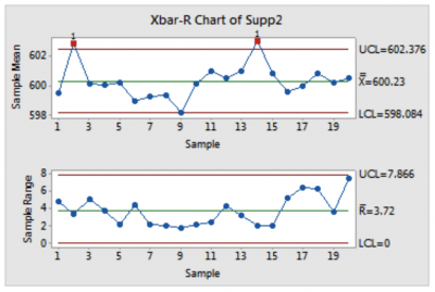
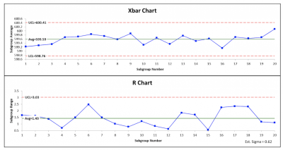
An industry example of a control chart
A producer of carbonated beverages used a control chart to monitor the performance of their two suppliers of corrugated containers. Since both had been doing a good job, the purchasing manager didn’t keep the charts up to date. Once the manufacturing manager started to complain about dimensional problems with the containers, purchasing started collecting current data.
As you can see from the two control charts below, Supplier 1 has an in-control process while Supplier 2 is wildly out-of-control.
Supplier 2 was brought in for a conference and told to get their process under control. Until then, Supplier 1 picked up all the business from Supplier 2. Because of the increased volume of business, Supplier 1 provided extra discounts to the company. A win-win for everyone, except Supplier 2.
Supplier 1
Supplier 2
3 best practices when thinking about a control chart
Here are a few tips to help you use a control chart to monitor your processes.
1. MSA
Since you will be making decisions based on your interpretation of a control chart, you want to be sure the data you are using is valid. Do an MSA (measurement system analysis) before collecting your data so you can have confidence the data properly represents the process.
2. Don’t control chart everything that moves
Identify your critical metrics before deciding on using a control chart. Unless the control chart is meaningful, it will just be another chart on the wall rather than the powerful tool it is.
3. Keep charts up to date
The control chart should be current and up to date for it to be useful.
Frequently Asked Questions (FAQ) about a control chart
What is a control chart used for?
It is used to distinguish between common and special cause variation.
Can a control chart be used for discrete data?
Yes. The control chart was first developed for continuous manufacturing data. Variations were developed to be used for discrete data with applications in almost every type of process and industry.
Does the data need to be normally distributed for the control chart to work?
No. Shewhart developed the control chart to be very robust and practical regardless of the data distribution.
Shewhart stated, “Some of the earliest attempts to characterize a state of statistical control were inspired by the belief that there existed a special form of frequency function f and it was early argued that the normal law characterized such a state. When the normal law was found to be inadequate, then generalized functional forms were tried. Today, however, all hopes of finding a unique functional form f are blasted.”
Summarizing the control chart
The control chart has been a powerful tool since the mid 1920s to monitor and gain insight into a process and its change over time. Control charts are used to distinguish between the two causes of process variation: common and special. Once you understand which type your process is exhibiting, you can take the appropriate action to address it.
The control chart can be used for continuous and discrete data gathered either singularly or in subgroups. A center line is drawn to represent the average of the data, and control limits are calculated to define the expected range of common cause variation. The proper interpretation of the control chart will tell you what changed in your process (and when) – and what didn’t change.