There are several graphical tools which allow for the visual comparison of different data sets. The box plot, for example, lets you compare multiple groups of data for the same Y variable. The radar chart uses overlays of group data for multiple Y variables. Let’s see how it works.
Overview: What is a radar chart?
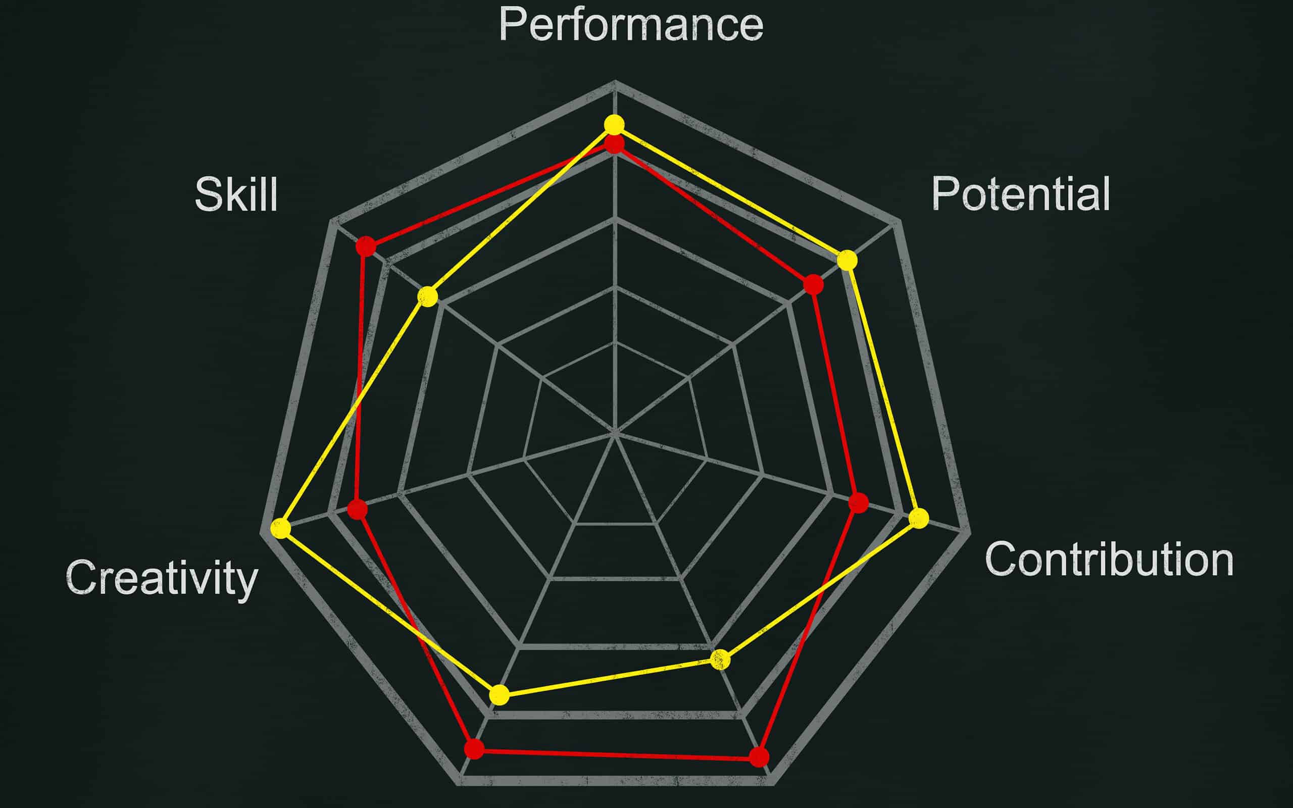
A radar or spider chart is a two-dimensional chart designed to plot one or more series of values over multiple quantitative variables. Each variable has its own axis, with all axes joined in the center of the chart. Radar charts are well suited for showing outliers and where there is overlap. It can be used to show when one variable is consistently better than others.
One of its limitations is that it may not provide a clear decision if one chart is greater than another on some variables, but less on others. Radar charts can also become hard to visually compare between different variables on the chart when their values are close together, so the differences are hard to distinguish.
Most statistical software packages, including Excel allow you to easily create a radar chart. See the example below of a radar chart developed in Excel.
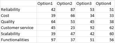
It is now easy to see how each option is scored on each of the variables:
- Option 2 is the best for reliability
- Option 1 is best for functionalities
- Option 3 provides the best customer service
An industry example of a radar chart
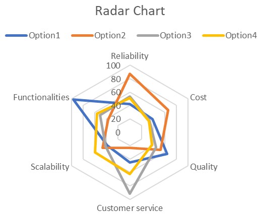
The development team of a software company was evaluating which of the optional upgrades to a current product they should release. They scored the various options across eight attributes and decided to use a radar chart to see if they could determine which might be the best option. See the data and radar chart below:
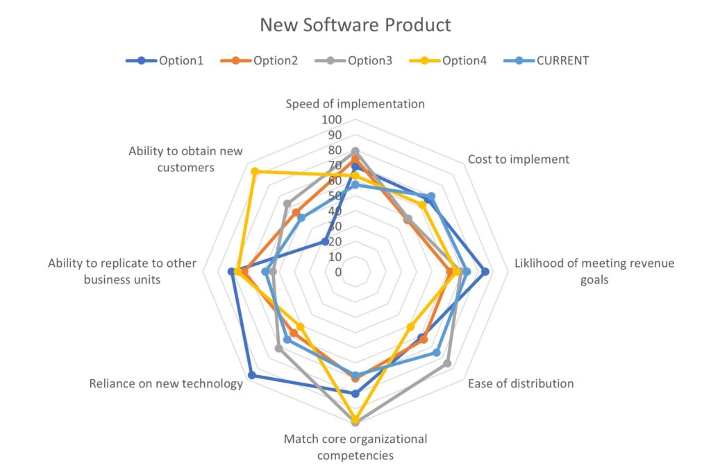
Options 1 and 4 seemed to stand out as superior on several of the evaluation criteria. They decided to use Conjoint Analysis to get direct feedback from their customers.
Frequently Asked Questions (FAQ) about a radar chart
Who developed the radar chart?
The development of the radar chart is commonly attributed to Georg von Mayr (1841 – 1925), a German scientist. His first use of a radar chart was approximately 1877.
How would you simply describe a radar chart?
A radar chart can be described as an irregular shaped polygon, or several irregular polygons overlayed on top of each other, all with the same center.
Can I use Excel to make a radar chart?
Yes. Once you have inserted a column of the variables and columns of data, you can find the radar chart under the Insert tab. You have the options of creating a basic radar chart, a radar chart with markers or a filled radar chart. See the graphic below:
