
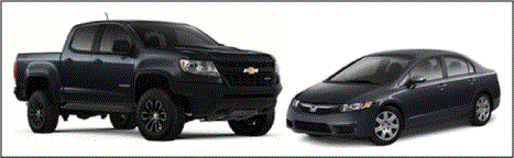
Late last year, I decided to upgrade my vehicle. For seven years I’d driven a Honda Civic. It was nothing special, just a reliable vehicle with good gas mileage – the perfect commuter car. But now I’ve got two kids, own a home and picked up woodworking as a hobby; fitting car seats and dimensional lumber into the Civic were mutually exclusive.
After much deliberation I decided to purchase a Chevy Colorado, and since I was going for a truck, I figured why not go all the way and chose the ZR2 edition just in case I found the need to ford rivers or scale mountains down the road. The truck came in and life was great – it sat up nice and high, the kids loved climbing in the back and trips to Home Depot were much easier. That is until I had to fill the gas tank! I knew I’d sacrifice fuel economy for utility but trading north of 30 miles per gallon (mpg) for less than 16 just wasn’t going to fly. It was time to put my Master Black Belt hat on and experiment!
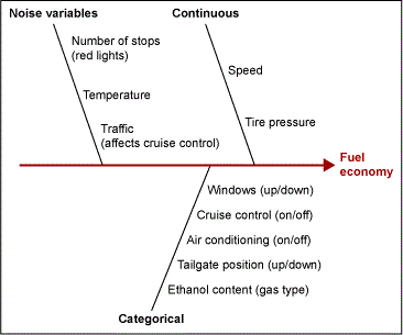
As I stepped to my whiteboard I was excited by the number of factors available for experimentation with the truck. I began to develop a fishbone diagram but rather than think in terms of the 6 Ms, I binned my variables into continuous, categorical and noise buckets. This helped to identify the factors I’d include in my experiment and those which may have an impact but which I couldn’t control in the future so understanding their impact was less critical. At the conclusion of this review I was left with my vehicle speed and the tire pressure as two continuous factors; the tailgate position being up or down and gasoline ethanol content as my categorical factors. The winter months made running the air conditioning and window position less than desirable and cruise control was added as an initial condition for all runs to reduce variability.
My next step was to take the desired inputs and determine my design. In this case I wasn’t overly concerned about the number of runs in my experiment. After all, I was traveling to work every day and this information could be collected with relatively little effort along the way, but I did note two hard to change (HTC) factors on the fishbone diagram. Tire pressure and the ethanol content in my gasoline would both be fairly onerous to deal with and would have negative consequences on my experimentation plan if fully randomized. Tire pressure changes would add time to every morning and evening which I wasn’t willing to incur and made much more sense to run together, and since changing the contents of my gas tank every day weren’t possible, randomizing that factor would have shifted this from a one-month-long study to one that consumed the better part of a year!
With these considerations in mind, I moved forward with designing a 2-level split-plot design with 2 hard-to-change and 2 easy-to-change factors. I decided to only track my to-work direction of travel to remove the variability associated with changes in topography and used cruise control during the stretch of highway I frequent. My factor levels were as follows: tire pressure: 30 psi (low) and 40 psi (high); fuel type: 87 octane (low) and 92 octane (high); tailgate position: down (low) and up (high); and finally speed: 5 mph under the posted limit (low) and 5 mph over (high).
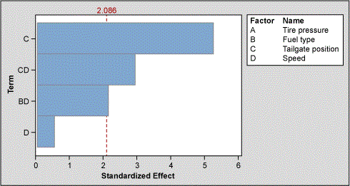
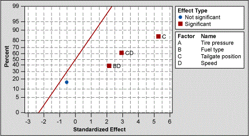
After collecting data for a little over a month, we were ready to analyze! I used the Pareto chart (Figure 3) and the normal plot of standardized effects (Figure 4) to fully reduce the model. What I found was that the tailgate position and an interaction between the tailgate position and speed, as well as the fuel type and speed were all significant.
From there, I used the optimizer to understand the sensitivity of the model and my expected fuel economy in the optimized setup. By driving with the tailgate down, 5 mph below the speed limit and with my tire pressure fully inflated, I could realize a fuel economy of 21 mpg, and a savings of over $400 per year!
Next, I reviewed the contour plot of mpg performance versus speed and tire pressure to investigate the opportunity for future experimentation.
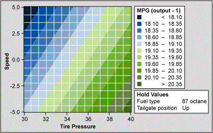
The contour plot shows that our best performance was at the lower right boundary where our tire pressure was highest and speed was lowest. Unfortunately, I’m not willing to drive any slower or risk popping a tire by increasing pressure any further, so I guess I’ll have to learn to live with a few more stops at the gas station. At least the trips to Home Depot are easier!