
In statistics, when we speak of something as being an outlier, it is often interpreted as a negative. Let’s see how we can determine whether a value is an outlier and understand how it should be interpreted.
Overview: What is an outlier?
In simple terms, a data value is considered an outlier if it is significantly higher or lower than the other values in your data set. But, what defines whether that difference is significant or not?
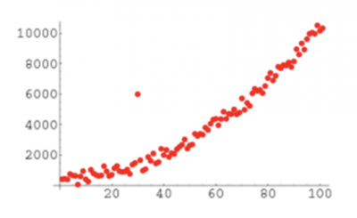
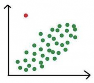
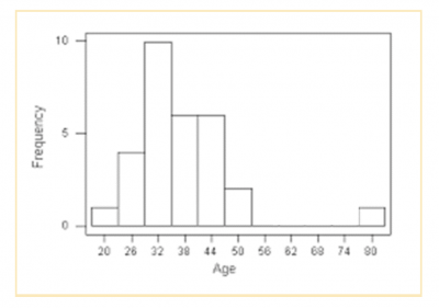
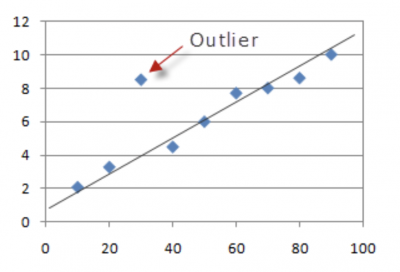
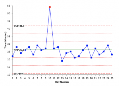
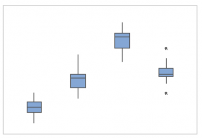
A number of graphical tools can be used to visualize whether something appears to be significantly different. Below is an example of a probability plot, scatter plot, histogram, and fitted line plot. It becomes visually obvious that one or more points are far away from the other points.
There are other tools which use statistics to define an outlier. Two examples of those are the control chart and the boxplot. Both use statistical calculations to determine if the distance from the rest of the data is considered statistically significant. Below are graphs of a control chart and boxplot. Note the one point in the control chart that is above the upper control limit has been flagged as an outlier by the software and is colored red. Also note that on the right most boxplot there are two stars which have been calculated and defined as outliers.
But, are all outliers bad? No. What if you were doing a boxplot of production and noticed a high value was classified as an outlier? That would be a good thing and you would strive to understand what happened that day to cause unusually high production. Then, rather than eliminating that cause you would seek to incorporate it in the hopes of having more high production days.
An industry example of an outlier
The sales manager of a small retail chain had been taught that a boxplot was a useful tool for comparing performance of multiple groups. Instead of poring over numerous Excel worksheets of sales for her different product lines, she decided to create a boxplot of sales for her four major product lines. Below is the boxplot she created.
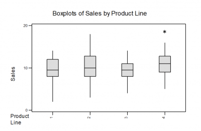
It became immediately obvious that product line two had the most variation in sales while product line three had the least. She also noticed the high outlier for product line four. She assumed something happened which resulted in an unexpectedly high rate of sales. She pulled her sales team together to research what happened and whether she could replicate it for product line four as well as the other product lines.
Frequently Asked Questions (FAQ) about an outlier
What are some causes for outliers?
Outliers may be caused by some unusual occurrence in your process that resulted in a data value different from the others. They may also be caused by data collection errors such as transposing a data value or misreading a gauge.
How is an outlier determined on a boxplot?
First, you must calculate the interquartile range (IQR) which is the difference between the first and third quartile values on the boxplot. Then you will multiply the IQR by 1.5 and add that value to the third quartile value and subtract it from the first quartile value. Any data values higher or lower than those calculated values will be flagged as an outlier.
Should you consider an outlier to be bad?
It depends. If that outlier was higher than some expected performance metric you might want to investigate the reason so you can possibly replicate the conditions which resulted in the better performance.