


Pareto Charts Training Slides
Pareto Charts Training Slides
Couldn't load pickup availability
Pareto Principle states that 80% of the situations of the problem can be traced to 20% of possible causes
--
A Pareto Chart, named after Vilfredo Pareto, is a type of chart that contains both bars and a line graph, where individual values are represented in descending order by bars, and the cumulative total is represented by the line.
A Pareto Chart is used to graphically summarize and display the relative importance of the differences between groups of data.
The purpose of the Pareto Chart is to highlight the most important among a (typically large) set of factors. In quality control, it often represents the most common sources of defects, the highest occurring type of defect, or the most frequent reasons for customer complaints, and so on.
The left vertical axis is the frequency of occurrence, but it can alternatively represent cost or another important unit of measure. The right vertical axis is the cumulative percentage of the total number of occurrences, total cost, or total of the particular unit of measure.
Because the reasons are in decreasing order, the cumulative function is a concave function. To take the example above, in order to lower the amount of late arriving by 80%, it is sufficient to solve the first three issues.
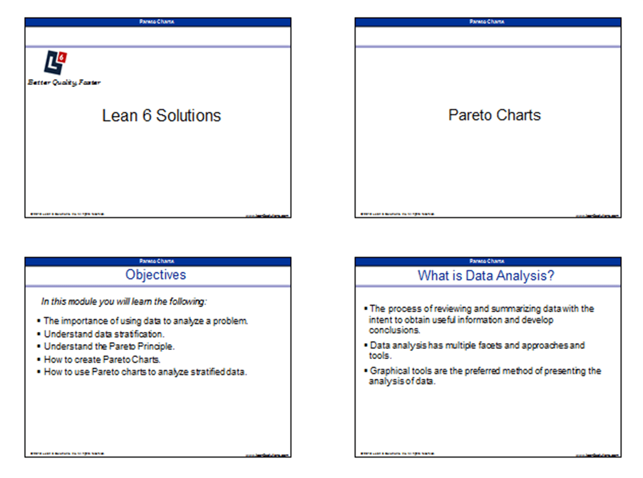
In this training course, you will learn the following:
- The importance of using data to analyze a problems
- How to understand data stratification
- Understand the Pareto Principle
- How to create Pareto Charts
- How to use Pareto charts to analyze stratified data
You can use these slides as a refresher for you, or in a training/classroom environment. The Pareto Chart Training Slides are designed for business professionals who are interested in applying process improvement techniques in their workplace.
Some of these professionals may include Quality Managers, Continuous Improvement Managers, Process engineers, etc.
Summary
- Data analysis is the process of reviewing and summarizing data in order to make logical conclusions.
- Stratifying data into logical categories in an important concept in process improvement.
- The Pareto Principle states that 80% of the situations of a problem can be traced to 20% of possible causes.
- A Pareto chart is an important tool for analyzing and summarizing stratified data.
[caption id="attachment_17503" align="alignnone" width="1250"]
 Sample image for training slides[/caption]
Open Source Six Sigma
More products from iSixSigma