
Purpose of a Pareto Chart
A pareto chart is used to graphically summarize and display the relative importance of the differences between groups of data.
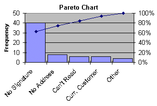
Sample Pareto Chart Depiction
How to Construct a Pareto Chart
A pareto chart can be constructed by segmenting the range of the data into groups (also called segments, bins or categories). For example, if your business was investigating the delay associated with processing credit card applications, you could group the data into the following categories:
- No signature
- Residential address not valid
- Non-legible handwriting
- Already a customer
- Other
The left-side vertical axis of the pareto chart is labeled Frequency (the number of counts for each category), the right-side vertical axis of the pareto chart is the cumulative percentage, and the horizontal axis of the pareto chart is labeled with the group names of your response variables.
You then determine the number of data points that reside within each group and construct the pareto chart, but unlike the bar chart, the pareto chart is ordered in descending frequency magnitude. The groups are defined by the user.
What Questions the Pareto Chart Answers
- What are the largest issues facing our team or business?
- What 20 percent of sources are causing 80 percent of the problems (0/20 Rule)?
- Where should we focus our efforts to achieve the greatest improvements?
Related Graphical Techniques