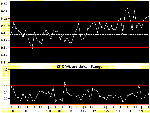
Everybody is familiar with control charts for quality control. An example of a control chart is shown below. In the example a packaging company who made blisters for the pharmaceutical industry found the process average for a critical characteristic was out of control. There were some ideas about possible causes but, as in most other companies, they were lacking the knowledge and resources to perform experimental design to find the causes of variation. They decided is to use their statistical process control (SPC) program to make the step from quality control to quality improvement.

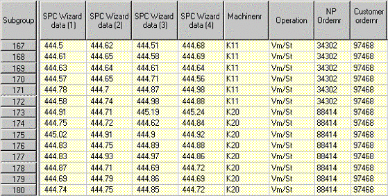
The first step the company took is to add extra information columns to their data. These columns can be used for tracking and tracing information like operator, lot number, batch number, etc. Other columns could be sources of variation like process parameters, machine batch numbers, temperature, humidity, etc. The company extracted this data from PLCs (programmable logic controllers) and from the company’s ERP (enterprise resource planning) system.

The control chart shows us when the process is out of control, but we can also use the same measurements to analyze if there are differences in the process between different settings or different material batch numbers.
The second step is to analyze the control chart and indicate where process changes are made. This can be done using vertical bars, but the charts are even more meaningful if we show the variation with each process change in zones. An example of the chart with specific zones for each material batch number is shown in the picture below.

Each zone in the graph above indicates a material batch change. The graph clearly shows that there are differences between batches and it seems that the process within a zone is statistically in control.
Another way to present the same data is the multi-vari chart (below is an example of a multi-vari chart).

We can see for example that the average of 6724 is higher than the average for 9988359. The obvious question is whether this is a significant difference or just random variation.
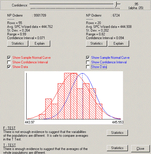
To compare the averages of two data sets we need to perform a T-test, but first you need to check if the two data sets are coming from a normal distribution and if the variability of the two datasets are more or less the same (F test).
In the example the F- and T-tests are calculated for the two selected datasets marked with a circle. For each point the actual data can be shown in the form of a small histogram standard with a normal curve superimposed on top of it. This allows us to check the data for normality (see screen shot below).

From this analysis the company found out the material batch number was the main cause of variation in their process.
The method above shows a very quick and effective way to make the step from quality control to quality improvement, and it helps closing the gap between using control charts and applying experimental design. The benefits of the approach described above are:
- Analysis can be performed by many more people than the specialists trained in experimental design. The techniques described above are much easier and faster to learn than experimental design.
- By adding extra columns with parameter information to the control charts and making operators responsible for recording data, you can perform many more experiments than by applying experimental design alone.
- The mindset of people using control charts will shift from process control to analysis for improvement.