Purpose of a Bar Chart
A bar chart is used to graphically summarize and display the differences between groups of data.

How to Construct a Bar Chart
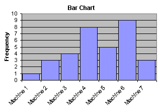
A bar chart can be constructed by segmenting the range of the data into groups (also called segments, bins or classes). For example, if your data ranges from machine to machine, you could have a group of data from machine 1, a second group of data from machine 2, a third group of data from machine 3, and so on.
The vertical axis of the bar chart is labeled Frequency (the number of counts for each bin), and the horizontal axis of the bar chart is labeled with the group names of your response variables.
You then determine the number of data points that reside within each bin and construct the bar chart. The groups are defined by the user.
What Questions the Bar Chart Answers
- What are the differences in system response between the groups?
- Does the data contain outliers?