|
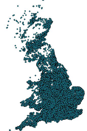
Here is another example of the use of IT in projects. I would like to describe how useful mapping is in data analysis. I will use a fictitious scenario. Sigma Industries have a fantastic product that VOC research says should be a phenomenal success. But the problem is product sales are not meeting expectations. As part of initial analysis the project team wish to estimate potential market size and Sigma Industries’ market share. They have one year of customer sales with details on each customer address. Using a mapping utility these addresses are converted into longitude and latitude and plotted.This is a start but shows far too much information (thousands of customer dots).
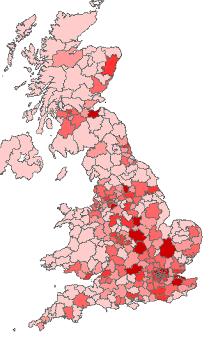
To see the wood from the trees these individual customers are aggregated into regional grouping using postcode sectors (like zipcodes). The customer hot spots are shown through colouring.
But we wanted to understand the overall market size and our share. So a 3rd party data set is bought containing all potential customers. A ratio is calculated of actual to potential customers. The information is displayed as a bar chart with market size in gold and the market share in black.
Hope this gives a good initial impression of the value of mapping in data analysis. I have found that once the core concepts are understood, it’s all very straightforward and new application keep appearing. More to come in a subsequent blog. |