
Key Points
- Non-normal data is data that does not fall within a normal distribution.
- You can utilize techniques like the Box-Cox method to get the data within normality.
- Understanding how to use non-normal data is going to have a huge impact on your statistical analysis.
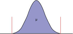
Six Sigma professionals should be familiar with normally distributed processes: the characteristic bell-shaped curve that is symmetrical about the mean, with tails approaching plus and minus infinity (Figure 1).
When data fits a normal distribution, practitioners can make statements about the population using common analytical techniques, including control charts and capability indices (such as sigma level, Cp, Cpk, defects per million opportunities, and so on).
But what happens when a business process is not normally distributed? How do practitioners know the data is not normal? How should this type of data be treated? Practitioners can benefit from an overview of normal and non-normal distributions, as well as familiarizing themselves with some simple tools to detect non-normality and techniques to accurately determine whether a process is in control and capable.
Spotting Non-Normal Data
There are some common ways to identify non-normal data:
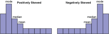
1. The histogram does not look bell-shaped. Instead, it is skewed positively or negatively (Figure 2).
2. A natural process limit exists. Zero is often the natural process limit when describing cycle times and lead times. For example, when a restaurant promises to deliver a pizza in 30 minutes or less, zero minutes is the natural lower limit.
3. A time series plot shows large shifts in data.
4. There is known seasonal process data.
5. Process data fluctuates (i.e., product mix changes).
Transactional processes and most metrics that involve time measurements exist with non-normal distributions. Some examples:
- Mean time to repair HVAC equipment
- Admissions cycle time for college applicants
- Days sales outstanding
- Waiting times at a bank or physician’s office
- Time being treated in a hospital emergency room
Why Does Non-Normal Data Matter?
Real-life data isn’t going to conform to the confines of a normal distribution. As such, it only makes sense to understand and take the necessary precautions to manipulate this data in a form that better suits your analytical process. If you reject data based on it being non-normal, you’re going to miss important points throughout any process.
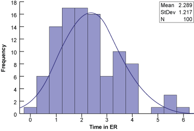
Example: Time in a Hospital Emergency Room
A sample hospital’s target time for processing, diagnosing, and treating patients entering the ER is four hours or less. Historical data is shown in Figure 3.
An Individual chart shows several data points outside of the upper control limits (Figure 4). Based on control chart rules, these special causes indicate the process is not in control (i.e., not stable or predictable). But is this the correct conclusion?
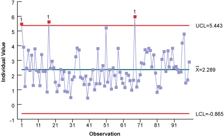
There are a couple of ways to tell the data may not be normal. First, the histogram is skewed to the right (positively). Second, the control chart shows the lower control limit is less than the natural limit of zero. Third, notice the number of high points and no real low points. These tell-tale signs indicate the data may not be normally distributed enough for an individual’s control chart.
When control charts are used with non-normal data, they can give false special-cause signals. Therefore, the data must be transformed to follow the normal distribution. Once this is done, standard control chart calculations can be used on the transformed data.
A Closer Look at Non-Normal Data
There are two types of non-normal data:
- Type A: Data that exists in another distribution
- Type B: Data that contains a mixture of multiple distributions or processes
Type A data – One way to properly analyze the data is to identify it with the appropriate distribution (i.e., lognormal, Weibull, exponential, and so on). Some common distributions, data types, and examples associated with these distributions are in Table 1.
| Table 1: Distribution Types | ||
| Distribution | Type Data | Examples |
| Normal | Continuous | Useful when it is equally likely the readings will fall above or below the average |
| Lognormal | Continuous | Cycle or lead time data |
| Weibull | Continuous | Mean time-to-failure data, time to repair, and material strength |
| Exponential | Continuous | Constant failure rate conditions of products |
| Poisson | Discrete | Number of events in a specific time (defect counts per interval such as arrivals, failures, or defects) |
| Binomial | Discrete | Proportion or number of defectives |
A second way is to transform the data so that it follows the normal distribution. A common transformation technique is the Box-Cox. The Box-Cox is a power transformation because the data is transformed by raising the original measurements to a power lambda (l). Some common lambda values, the transformation equation, and the resulting transformed value assuming Y = 4 are in Table 2.
| Table 2: Lambda Values and Their Transformation Equations and Values | ||
| Lambda (Λ) | Transformation Equation | Transformed Value |
| -2 | 1/Y2 | 1/42 = 0.0625 |
| -0.5 | 1/((sqrt)Y) | 1/((sqrt)4) = 0.5 |
| -1.0 | 1/Y | 1/4 = 0.25 |
| 0.0 | Lognormal (ln) | The logarithm having base e, where e is the constant equal to approximately 2.71828. The natural log of any positive number, n, is the exponent, x, to which e must be raised so that ex = n. For example, 2.71828x = 4, so the natural log of 4 is 1.3863. |
| 0.5 | (sqrt)Y | (sqrt)4 = 2 |
| 1.0 | Y | 4 |
| 2.0 | Y2 | 42 = 16 |
Type B data – If none of the distributions or transformations fit, the non-normal data may be “pollution” caused by a mixture of multiple distributions or processes. Examples of this type of pollution include complex work activities; multiple shifts, locations, or customers; and seasonality. Practitioners can try stratifying or breaking down the data into categories to make sense of it.
For example, the cycle time required for attorneys to complete contract documents is generally not normally distributed. Nor does it have a lognormal distribution. Stratifying the data can make some contract documents, such as residential real estate closings, much simpler to research, draft, and execute than more complex contract documents.
Hence, the complex contracts represent all the longer times, while the simpler contracts have shorter times. Another approach is to convert all the process data into a common denominator, such as contract draft time per page. After, all the data can be recombined and tested for a single distribution.
Revisiting the Hospital Example
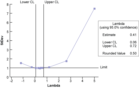
Because the hospital ER data is non-normal, it can be transformed using the Box-Cox technique and statistical analysis software. The optimum lambda value of 0.5 minimizes the standard deviation (Figure 5).
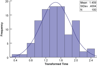
Notice that the histogram of the transformed data (Figure 6) is much more normalized (bell-shaped, symmetrical) than the histogram in Figure 3.
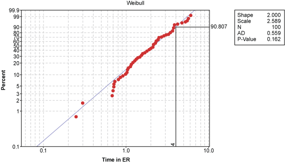
An alternative to transforming the data is to find a non-normal distribution that does fit the data. Figure 7 shows probability plots for the ER waiting time using the normal, lognormal, exponential, and Weibull distributions.
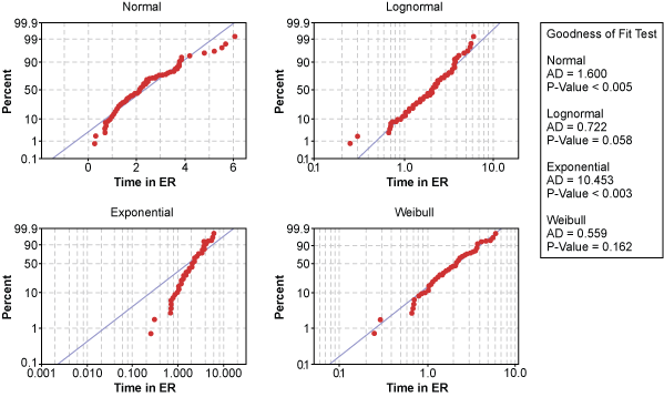
Statistical software calculated the x– and y-axis of each probability plot so the data points would follow the blue, perfect-model line if that distribution was a good fit for the data. Looking at the various distributions, the exponential distribution appears to be a poor model for hospital ER times.
In contrast, data points in the lognormal and Weibull probability plots follow the model line well. But which one is the better distribution?
The Anderson-Darling Normality test can be used as an indicator of goodness-of-fit. It produces a p-value, which is a probability that is compared to the decision criteria, alpha (a) risk. Assume a = 0.05, meaning there is a 5 percent risk of rejecting the null when it is true. The hypothesis test for this example is:
Null (H0) = The data is normally distributed
Alternate (H1) = The data is not normally distributed
If the p-value is equal to or less than alpha, there is evidence that the data does not follow a normal distribution. Conversely, a p-value greater than alpha suggests the data is normally distributed.
The p-value for the lognormal distribution is 0.058 while the p-value for the Weibull distribution is 0.162. While both are above the 0.05 alpha risk, the Weibull distribution is the better distribution because there is a 16.2 percent chance of being wrong when rejecting the null.
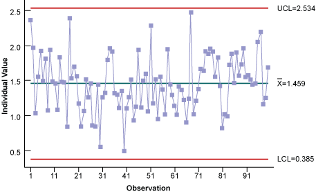
Now the Weibull distribution can be used to construct the proper individual control chart (Figure 8). Notice all of the data points are within the control limits; hence, it is stable and predictable.
Now that the process is in control, it can be assessed using indices such as Cpk (Figure 9). Overall, this is a predictable process with 8.85 percent of ER visit time out of specification.
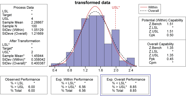
A similar assessment can be made with a probability plot, which shows this is a predictable process and that 91 percent of the ER waiting times are within four hours. Put another way, only 9 percent of the patients will take longer than the four-hour target to be processed, diagnosed, and treated in the hospital ER. This is an explanation that management can readily understand.
Other Useful Tools and Concepts
Looking for other ways to manipulate your data? You might do well to learn how to best utilize the Box-Cox Power Transformation. We touched on it briefly throughout today’s article, but it is one of the most effective ways of transforming non-normal data you have.
Further, if you need additional tips on dealing with non-normal data, we’ve got you covered. We have an entire guide on tools and strategies that are best suited for dealing with data that doesn’t fall in with a normal distribution.
Better Knowledge, Better Decisions
Non-normal data may be more common in business processes than many people think. When control charts are used with non-normal data, they can give false signals of special cause variation, leading to inaccurate conclusions and inappropriate business strategies.
Given this reality, it is important to be able to identify the characteristics of non-normal data and know how to properly transform the data. In doing so, practitioners will make better decisions about their business and save time and resources in the process.