Ordered category data is discrete data representing appraiser or client perception against a rating scale such as a survey or questionnaire. Black Belts learning to apply the Six Sigma methodology to ordered category data are traditionally taught analytical methods that include normal and Poisson distributions. This is probably due to Six Sigma’s beginnings in manufacturing. These methods are not as useful in the services sector as most of the data is discrete. However, there are alternate methods for analyzing discrete ordered category data that are specifically useful when structuring voice of the client processes.
Top Box Analysis
The table below contains results from a survey capturing 150 client perceptions of service received during hotel stays. Each item in the survey represents an input or X variable providing unique value to the customer in the end-to-end process. The last item, “Value for the Money,” reflects the customer perception of the overall value for the service provided and represents the Y variable or output for the process.

A review of the average scores on the survey leads to some conclusions about hotel performance. However, the scores do not provide an ability to determine how to proactively address deficiencies, how each item governs the overall performance, or the amount of effort necessary to improve service levels.
One of the most common approaches to determining answers to these questions is top box analysis. Survey agencies such as Gallup and Press Ganey use standardized formats of top box analysis to report their findings. Top-one box refers to the upper-most category of the rating scale. In the hotel example above, the first category is the top-one box. Data is evaluated using the frequency distribution rather than average values.
A common method of analysis compares historic data with current data to judge performance trends. In some cases population data is used instead of historic data. In the table below, cumulative ratings obtained for the entire group of hotels is compared to rating for a single region.

The data suggests that overall performance is better than the northern region and also indicates that the top-one box has eroded while the top-two box has not.
Normalized Average as a Measure of Performance
When comparing averages from two different rating scales, normalizing the data will provide a more statistically valid view of the outcomes. The table at the right provides an example of the benefits of normalizing averages. An initial review of the averages reflects a higher rating for the competitor’s data. When the average is divided by the size of the rating scale, the normalized average presents a more accurate and useful view of the data.
Coefficient of Variation (Cv) as a Measure of Performance
Comparing standard deviations in absolute terms is not effective when the averages are vastly different from each other. A more effective method is to normalize the averages by dividing the standard deviation with the average. This is known as the coefficient of variation (Cv). Normalized average and coefficient of variation are useful to report performance of a process and when analyzed in tandem, provide clues to the root causes of process inefficiencies.

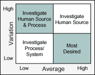
Human intervention in a process commonly creates variation in the system over time, typically producing high short-term capability and low long-term capability. A high Cv points to sources of variation attributed to resources, timeframes, geographies, etc. Alternatively, a low average performance is usually a result of inefficiencies in the process. Figure 1 provides a matrix for evaluating average and variation together to suggest probable focus areas for improvement. When evaluating the matrix, the following guidelines will assist in reducing subjectivity:
- A high in average is any value that falls in the top-one box or above the target value if it agrees with customer perception.
- A low in variation is any value of standard deviation for which 99 percent of the distribution falls within the top-one box. A good rule of thumb is a standard deviation of 0.17 on a 1-to-5 scale.
When investigating the matrix results, the cause-and-effect diagram (fishbone), failure mode effects analysis (FMEA) and process map are effective tools to determine root cause of process inefficiencies.
Correlation Coefficient as a Measure of Performance
Another analytical method to compare current performance against target or historical data is the correlation coefficient. It is generally understood that processes cannot sustain defect-free outputs over a substantial length of time. There is an expected frequency distribution that can be derived for any given time period. Measures of correlation are useful to compare actual performance in a specific region against target or historical performance. When the actual frequency distribution closely resembles the expected distribution the correlation coefficient is close to +1. In situations where the correlation is moderate (0.6 to 0.8) and there is a drastic increase in the average value as compared to the target, a positive improvement in performance has occurred. Alternatively, a poor correlation with a low average suggests that the performance has largely deteriorated.
Correlation also is useful to establish the relationship between inputs or root causes. The final table below displays the coefficient of correlation for the hotel survey elements or X variables as compared to the value for the money Y variable. A strong correlation between a specific X variable and the Y variable suggests that it is a vital X.
|
Correlation |
Hospitality |
Turn Around Time |
Ambience |
Amenities |
Quality of Food |
| Value for the money |
0.83 |
0.98 |
0.84 |
0.86 |
0.14 |