
Six Sigma practitioners often state that Six Sigma is not about learning statistics, but is instead about understanding which tool to apply to each situation and how to properly interpret the results. We will attempt to understand the meaning of this statement in four real world examples I have experienced in industry.
Control Charts Subgrouped By Personnel Shifts
In one of my consulting assignments I was explaining to participants the use of control charts and how they are only able to distinguish between process special causes and common causes. During these discussions one of the participants enthusiastically explained how they had implemented control charts in a continuous process and wanted to know whether the method applied was correct.
The participant explained that there is one particular parameter in the process that is critical and is monitored on an hourly basis. They collected data with a subgroup of eight, representing one shift, and based on the resulting calculations created their control charts. These control charts were updated every eight hours at which time the process capability was calculated.
What is your assessment of this situation?
There were a few mistakes in the method used. Without getting into any statistical analysis, the first mistake that can be discovered through common sense is that the organization is plotting one point every eight hours. That means that they can detect a special cause only every eight hours. The question I raised with the participant was whether the process stable enough that they can wait for eight hours to detect a special cause! And if the process is stable enough to wait eight hours, why measure and collect the parameter values every hour? In the statistical terms, the organization possesses an extremely high beta risk.
Why was the participant using this type of analysis method? Had the participant understood the key assumptions in the formation of the X bar R control chart subgroups, this type of mistake might not have been committed. The key assumption in the formation of subgroups is that the variation within the subgroups is only due to common causes. This assumption must be carefully considered in order to eliminate potential control chart mistakes.
If properly trained in Six Sigma, the organization might have applied the control charts more appropriately and would have selected either the IMR Chart, Zone Chart, CUSUM chart or EWMA Chart. In doing so, they would have paid more attention to the engineering logic and the statistical assumption in the application of the charts rather than the calculations of plotting the charts.
Control Charts Subgrouping At A QS 9000 Automobile Supplier
The second example occurred at a QS 9000 supplier to an automobile manufacturer. As per the documented procedures of the company, the organization was required to send detailed process capability reports with a particular machined component. The organization manufactured the machined components and then sent all the machined components in a bin to the final inspection department. The final inspection departments then took five as the subgroup and inspected the entire lot. At the end of the inspection cycle, they plotted an X Bar R chart and the process capability indexes. The automobile company receiving this material was satisfied that the supplier was complying to the requirements.
What was wrong with the application described above?
The organization had only learned the application of statistical process control (SPC) and control charts, without fully understanding the concepts and underlying assumptions. The key requirement for the application of SPC is the conservation of time sequence during the application of the charts. The subgroup assumption violated this requirement, as the subgroups were made at the end inspection process. Since the time sequence is not preserved, the assumption that the variability within the subgroup is only due to common causes cannot be validated.
The first mistake that can be discovered through common sense is that the organization is only attempting to comply with documentation requirements. They gained no knowledge of the underlying process variability and would have tremendous difficulty trying to improve it. It is application of statistical techniques such as these that dilute the essence of good standards like the QS 9000 and ISO 9000.
Calculating Process Capability Without Control Charting
The third example occurred at an organization that was regularly reporting the process capability of business key processes at management meetings. On studying the methods used for the calculation it was seen that the process variables were never plotted on control charts. In addition, the process capability was calculated using the sample standard deviation formula.
What was wrong with the application described above?
In the calculation of process capability indexes, the first assumption that is critical is that the process is normal. By not validating this assumption the organization was running a huge risk of misinterpreting the voice of the process.
The company was also using an incorrect method of calculating the process capability. In the calculation of Cp and Cpk, the most important consideration is the use of standard deviation that is estimated as the population standard deviation – free of special causes estimated from the subgroups formed. The sample standard deviation calculated by the company included variation due to special causes, which is more appropriate for the calculation of Pp or Ppk.
In the process of simple process capability calculations, assumptions that were overlooked and the absence of control charts deprived the organization of important process knowledge that would help in understanding process variation. Understanding variation is the first step in continuously improving business processes.
Control Charts Subgrouping By Machine Nozzle
My final example is one that often occurs in manufacturing organizations. Many manufacturing plants contain machines that pack material into bags or boxes. In this case, the machine had three nozzles. The organization was contemplating application of control charts to measure the process performance.
The engineers were contemplating using a subgroup of three to represent the three nozzles of the machine. The data would be collected on an hourly basis for control chart plotting.
What was wrong with the application described above?
The engineers are assuming that there is no special cause acting between the nozzles, and that only common cause variation exists between the three nozzles. This seems to be a dangerous assumption.
In addition, the engineers wanted to take three consecutive samples from each nozzle – for subgroup purposes – to estimate the population standard deviation without special cause variation. They would then calculate the control limits, sample one bag from each nozzle, and use a subgroup of three to plot the control charts. Subgroups made in this fashion meet the assumption of common cause variation within the subgroups. The R bar chart will give information about within nozzle variation and the X bar chat will give information about variation in time. But such an application would be a very conservative control charting approach, and the chance of conducting an alpha risk would be very high.
Proper planning, as well as an understanding of the process, will help with the application of control charts. In this situation it would be a good idea to actually decide on a sampling plan – like collecting five consecutive readings from each nozzle each hour until 25-30 subgroups per nozzle are collected.
Various tools and techniques can be applied to confirm the assumption of common causes between the nozzles. A good Six Sigma black belt would never only rely on the results presented from one method, but would instead apply various methods and confirm the hypothesis based on the analysis.
For example, Figure 1 displays a simple box plot that can be used to verify whether there is any variation between the various machine nozzles.
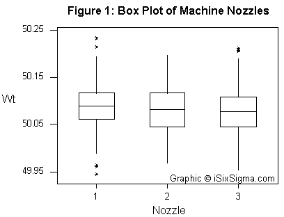
The above box plot graphically displays whether there is any difference between the various nozzle heads. The graph above indicates that there is no apparent difference between the various nozzles.
This analysis can then be confirmed with a multi-vari chart. A multi-vari chart can yield insights on whether the variation due to nozzles is high or the variation due to time factor is high. Such an analysis can be seen in Figure 2.
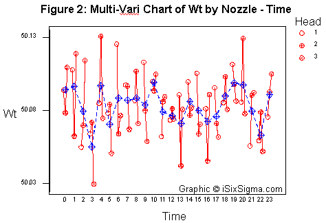
The graphical multi-vari chart indicates that there is no cause of concern regarding the variation due to the nozzle heads.
The variation can now be quantified by using a nested analysis of variance (ANOVA) as shown below in Figure 3.
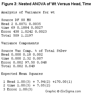
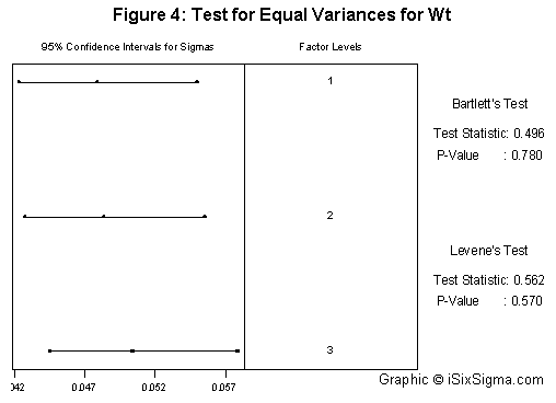
The ANOVA further confirms the fact that of the total variation nozzle head contributes to only to 0.18 percent. A hypothesis test for equal variances can also be used, the results of which are shown below in Figure 4.
All the various tools shown above will help confirm the hypothesis. Once these assumptions are confirmed, it would be safe to use three as the subgroup size as representatives of each of the nozzles. In case the nozzles are found to behave differently, it would make sense to focus on the particular nozzle behaving differently by creating control charts for that particular nozzle so that more understanding of the process can be gained.
As we’ve seen from the four examples presented above, it is imperative that Six Sigma black belts understand which statistical tools can help understand process variation, and what underlying assumptions are associated with each tool.