
Multivariate analysis techniques may be useful in statistical process control (SPC) whenever there is more than one process variable. Multivariate control charting is usually helpful when the effect of multiple parameters is not independent or when some parameters are correlated. This article focuses on parameters that correlate when the Pearson correlation coefficient is greater than 0.1. (Ranging from -1 to +1, the Pearson correlation coefficient is a measure of the degree of the linear relationship between two variables.) Applying univariate control charts is possible but inefficient – and can lead to erroneous conclusions. Multivariate methods that jointly monitor these variables is an alternative approach.
Here is a simple hypothetical two-variable example to illustrate how an erroneous conclusion may be made. Figures 1 and 2 are a simple two-variable example that illustrates the potential for an analysis error.
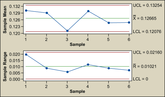
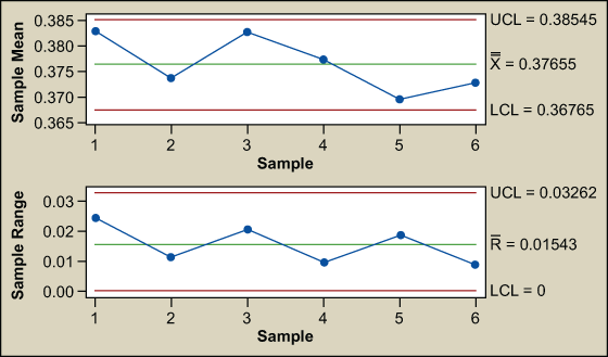
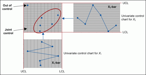
The control charts for X1 and X2 are stable and in control. None of the Western Electric rules (rules for detecting out-of-control conditions on control charts) have been violated. It seems as though all is well; however, there is more to the story. Plotting X1 versus X2 shows a point separated from the rest (Figure 3). The joint control region is the ellipse formed by the normal data.
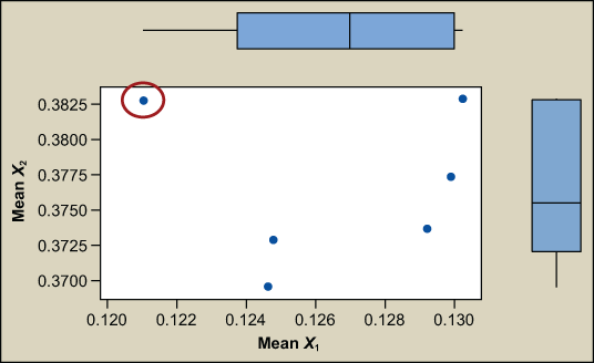
(Note: If the process is not creating defects in the region where X1 and X2 are not typically operating [see red circled area of Figure 3 above], then there is no point to alerting the process. This approach only works if a defect is made.)
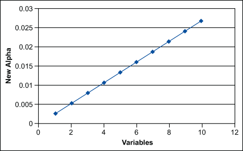
That observation (data point circled in red) appears unusual compared to the others when examined simultaneously. Two others might be questionable. What is going on? The probability of an out-out-control point in a univariate chart (X1 or X2 exceeding their respective 3 sigma limits) is 0.0027, 1 in 370 (Z = 3, P(d) = 0.00135 per tail, so 2 tailed = 0.0027). The risk of making a wrong decision increases rapidly as the number of variables increase. The probability of simultaneously detecting an out of control point in 2D space using univariate charts is the straight multiplication of the probability of detection in the individual charts. The probability of X1 and X2 simultaneously exceeding their respective 3 sigma limits is (0.0027) x (0.0027) = 0.00000729.
The alpha risk – the risk of not detecting a special cause – is:
α‘ = 1 – (1- α)p
where p = the number of factors
α = the risk of error (0.0027)
α‘ = the adjusted risk
The alpha risk increases linearly as the number of factors increase. So, in a multivariate situation the likelihood of missing a special cause increases as the number of factors increase.
The overall goal of process control is to produce products that are uniform around a target. Walter A. Shewhart, the father of control charts, described two types of mistakes that can be made in the effort to achieve uniformity. They are:
- Attributing an outcome to special cause of variation when it comes from common causes of variation.
- Attributing an outcome to common causes of variation when it comes from a special cause.
The goal is to make these mistakes infrequently. Here, however, the risk of these mistakes increased.
In this example, the process is not dominated by a single factor, but by more than one important related factors. Multivariate control chart techniques can be applied to monitor our process. By using a multivariate model with a control ellipse, as in this example, the out-of-control point can be detected.
When correlation exists among quantitative variables on a single experimental unit, a single control chart based on Hotelling’s T2 statistic (testing hypotheses on multiple measures) will provide an alpha level (no more risk inflation) and greater sensitivity to out-of-control points than multiple X-bar and R charts.
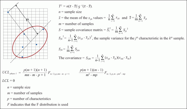
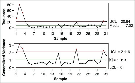
Why are these multivariate control charts not used more frequently? The associated calculations are laborious. We need to calculate the subgroup means for each variable, X1 and X2 …Xn, calculate the subgroup variances and the subgroup covariances. Then calculate the mean of the subgroup means, the mean of subgroup variances and the mean of the covariances. Next, designate the sample covariance matrix and the mean vector. Then calculate T2 and the control limits. Finally T2 can be compared to the control limits to determine if individual points are out of control. These calculations are time-consuming and confusing; however, conceptually it is simple. For this two-factor example, the calculations establish an ellipse (Figure 6). The T2 statistic measures the distance from the centerline of the ellipse to each point. T2 is plotted on a Shewhart type of chart. A T2 chart is the multivariate analogy of the X-bar chart. Control limits are based on the F-distribution for subgroups.
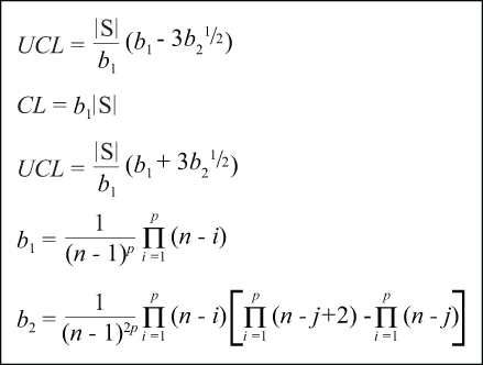
The generalized variance chart is analogous to the R-chart but with more intensive calculations.
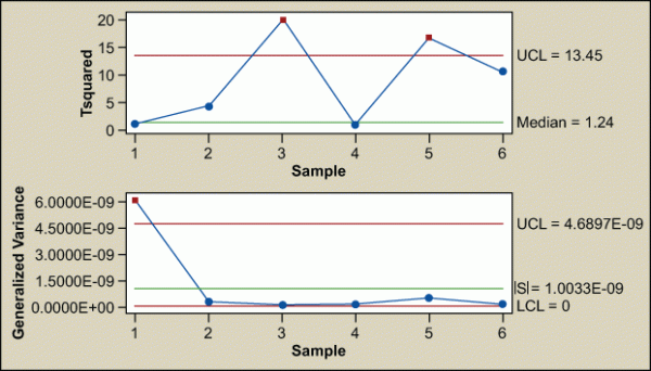
Fortunately, software is able to perform these calculations with just a few clicks of a mouse. For this example, two points would be flagged as special cause as well as a variation-driven stability concern (Figure 7).
Is X1 or X2 – or both – driving the out-of-control points? An automatic decomposition output is shown here.
| Test Results for T2 Chart of X1, X2 | |||
| Point | Variable | p-value | |
| Greater than UCL | 3 | X1 | 0.0001 |
| 5 | X1 | 0.0209 | |
| X2 | 0.0018 | ||
Test Results for Generalized Variance Chart of X1, X2
TEST. One point beyond control limits.
Test failed at points: 1
This output indicates that point 3 is driven by X1 and point 5 is driven by both X1 and X2; therefore, both must be investigated even though the univariate charts indicated both variables were stable and in control (refer back to Figures 1 and 2).
After finding the issue with points 3 and 5, corrections can be made and control can be monitored with the T2 and general variance chart.
That simple two-variable example was an easy one for visualizing the joint control space. Let’s look at a complex injection-molding process with many related variables such as fill time, recovery time, transfer pressure, transfer position, nozzle temperature and cycle time (Figure 8).
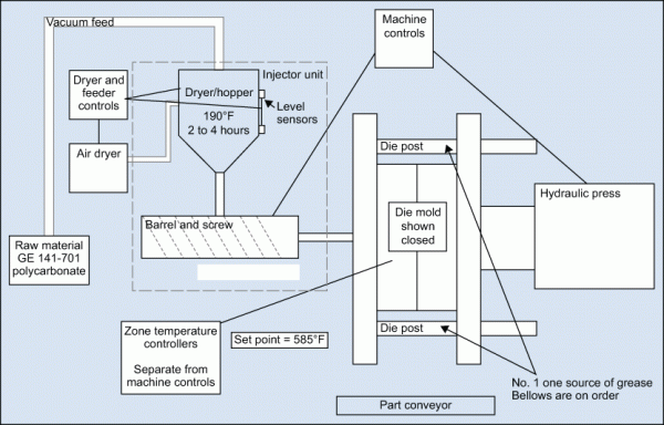
There are correlations between these variables that indicate they are not independent.
| Correlations Among Variables | |||||
| Cycle Time | Fill Time | Recovery Time | Transfer Position | Transfer Press | |
| Fill Time | 0.090 | ||||
| Recovery Time | 0.299 | 0.083 | |||
| Transfer Position | -0.023 | -0.115 | -0.426 | ||
| Transfer Press | -0.077 | 0.110 | -0.257 | -0.200 | |
| Nozzle Temperature | -0.025 | -0.059 | -0.024 | 0.065 | -0.072 |
| Cell contents: Pearson correlation | |||||
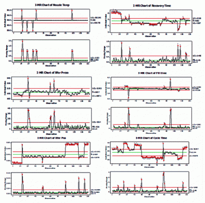
All of these variables exhibit special cause variation in the individual control charts. Where should improvement efforts be focused and prioritized?
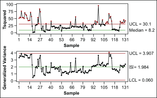
T2 and generalized variance charts can be created (Figure 10). There are still many out-of-control points.
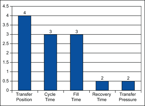
Then look to the decomposition and create a Pareto of the number of times each variable contributed to out-of-control points (Figure 11).
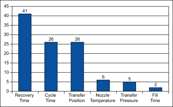
This indicates that the factors that drive recovery time should be looked at. It is time to consult the process experts and allow improvements to be made. The multivariate chart constructed after changes were implemented shows improvement.
The process of looking to the decomposition and creating a Pareto chart must be recreated now. The practitioner must investigate what about these points is driving the variables (transfer pressure, cycle time, fill time, recovery time and transfer pressure) to an abnormal region of the control space. It is time to return to the experts to continue the process improvement work.
When multiple variables are related, individual univariate control charts can be misleading and at best are inefficient. Hotelling’s T2 and generalized variance control charts are useful for continuous improvement and process monitoring. The availability of reliable software takes the math “magic” out of these control charts. Although the example used here is manufacturing related, the tool is not limited to production issues.