
Having refined the project’s key outcome measures, defined performance standards for project Y‘s, identified segmentation factors and defined measurement systems, the Six Sigma project team of the IT services business began to focus on the Analyze phase. The DMAIC (Define, Measure, Analyze, Improve, Control) roadmap called for work in these areas during the Analyze phase:
A1. Measure Process Capability: Before segmenting the data and “peeling the onion” to look for root causes and drivers, the current performance is compared to standards (established in step M2 of the Measure phase).
A2. Refine Improvement Goals: If the capability assessment shows a significant departure from expectations, some adjustment to the project goals may need to be considered. Any such changes will, of course, be made cautiously, supported with further data, and under full review with the project Champion and sponsors.
A3. Identify Significant Data Segments and Patterns: By segmenting the Y data based on the factors (X‘s) identified during the Measure phase – the team looks for patterns that shed light on what may be causing or driving the observed Y variation.
A4. Identify Possible X’s: Asking why the patterns seen in A3 are as observed highlights some factors as likely drivers.
A5. Identify and Verify the Critical X’s: To sort out the real drivers from the “likely suspects” list built in A4, there is generally a shift from graphical analysis to statistical analysis.
A6. Refine the Financial Benefit Forecast: Given the “short list” of the real driving x’s, the financial model forecasting “how much improvement?” may need to be adjusted.
A1. Measure Process Capability
The team first looked at the distribution of each Y data set. For those with symmetrical shapes close enough to a normal distribution (the bell-shaped curve in Figure 1) means-based measures (e.g., mean, sigma, or Cp and Cpk) were used to describe capability. For skewed distributions (the histogram in Figure 1, and any cases where the Anderson-Darling test P-value was below about 0.05) a median-based capability measure was used (e.g., median, quartile, percentile).
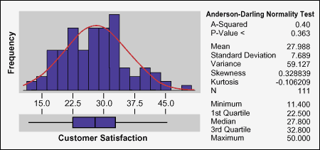
While the graphical summary in Figure 1 shows median-based capability to the detail of quartiles (1st quartile: 25 percent, median: 50 percent, and 3rd quartile: 75 percent), the team applied a macro to generate a more detailed percentile view, summarized in the list below.
75th percentile = $32.80
80th percentile = $33.36
85th percentile = $35.42
90th percentile = $39.44
95th percentile = $42.68
98th percentile = $44.73
The support cost 90th percentile capability is $39.44. Call volume, of course, indicates that this was a very costly gap. The results of these and other capability checks, as done at the outset of the Analyze phase, are summarized and compared to established targets in the table below.
| Measure | Capability | Target |
| Customer Satisfaction (Per Collins Industry Assessment) | 90th percentile = 75 percent satisfaction | 90th percentile = 85 percent satisfaction |
| Support Cost Per Call | 90th percentile = $39 | 90th percentile = $32 |
| Days to Close | 90th percentile = 4 days | 90th percentile = 3 days or less |
| Wait Time | 90th percentile = 5.8 minutes | 90th percentile = 4 minutes |
| Transfers | 90th percentile = 3.1 | 90th percentile = 2 |
| Service Time | Mean: 10.5 minutes StDev: 3 minutes |
Mean:StDev: |
A2. Refine Improvement Goals
Reviewing the data in the table, the team felt that the project targets were still in line and did not require a change at that time. Had there been a surprise or a show stopper, that would have been the time to flag it and determine the right action.
A3: Identify Significant Data Segments and Patterns
While planning for data collection (during the Measure phase), the team had done some hypothetical cause-and-effect analysis to identify potentially important X‘s. At this step, it prepared to use the data to confirm or reject those earlier hypotheses, and to discover other X‘s that may have been missed.
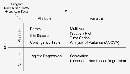
Figure 2 outlines some of the common tools for finding patterns in the data. Since most tools are suited for certain kinds of data, a chart like this can be helpful. Like many teams, during A3 this team favored graphical tools, which give quick views of many “cuts” on the data. The team found multi-vari charts were especially flexible in that regard. Later, when refined distinctions were called for (in step A5) the statistical tools like ANOVA, regression and chi-square were brought into play.
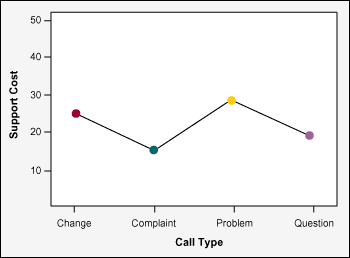
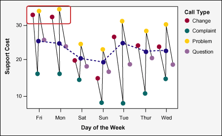
Numerous cuts of the data were reviewed with the goal of shedding light on root causes and drivers underlying variation in the project Y‘s. A few of those are summarized in Figures 3 and 4. Figure 3 shows that problems and changes look more expensive to service than other types of calls. Figure 4 reveals an added signature in the pattern – Mondays and Friday stand out as being more costly.
A4: Identify (Refined/More Detailed List of) Possible X’s
Collecting the findings that came out of A3, the team posed strongest in the form of “why” questions:
- Why do problems and changes cost more than other call types?
- Why are calls processed on Mondays and Fridays more expensive?
- Why do transfer rates differ by call type? (higher on pProblems and changes, lower on others)
- Why are wait times higher on Mondays and Fridays and on Week 13 of each quarter?
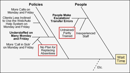
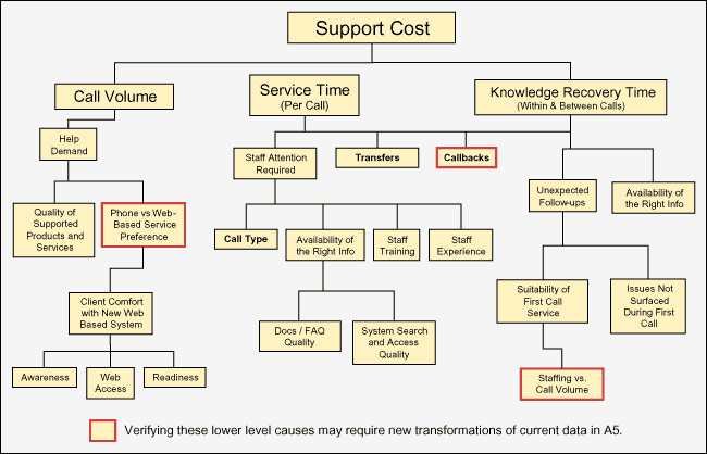
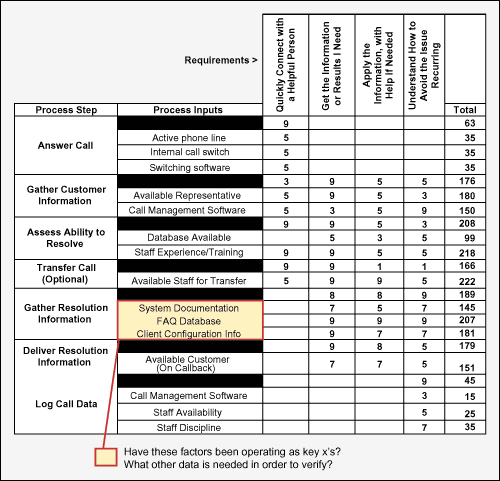
The team reviewed the fishbone diagrams, Y-to-X trees, and cause-and-effect matrices that it had built during the Measure phase. At this step, with the benefit of the data and insight gained during A3, the team was ready to get closer to what was really driving the Y‘s. Figures 5, 6 and 7 trace the team’s thinking as it moved through this step. Figure 5 highlights questions about the driving influence of staff availability – and why it may vary so widely on Mondays and Fridays. Figure 6 highlights the issue of staffing/call volume as a ratio. The initial data had looked at these factors individually. Figure 7 raises questions about several factors that were not measured initially – but the data may suggest these as realistic lower-level X‘s that should be studied using a sample of follow-on data.
The work represented in the previous figures motivated the next round of analysis, step A5, to check the deeper relationships hypothesized. As is often the case, the team had identified some new data that could be useful. Further, it had uncovered some new ways to “torture” the current data to reveal more root cause insights:
- Volume to staffing ratio – Call volume and staffing had not revealed much when looked at separately. Their ratio may be more interesting.
- Web-to-phone issue call traffic ratio could be computed from the initial data – potentially revealing more insight.
A5: Identify and Verify the Critical X‘s
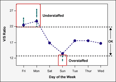
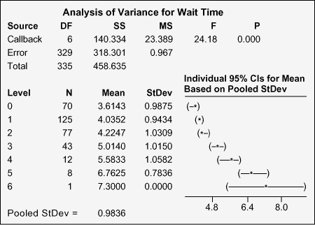
The team made the computations and comparisons suggested by its cause-and-effect work. During this step, there was a leaning toward the statistical tools, to make the verification of driving X‘s more fact-based and convincing. Figures 8 and 9 illustrate a few elements in that work. Figure 8 shows that some days can be understaffed (Fridays and Mondays) and others (especially Sundays) can be overstaffed. Figure 9 shows that the influence of callbacks on a call’s wait time (graphed during A3) is statistically significant (indicated by the P of less than 0.05 in the Callback row of the ANOVA table).
A6: Refine the Financial Benefit Forecast
In its charter, the team had signed up to reduce support costs per call from the current level (as high as $40) to $32. Given the team’s analysis on factors driving support cost, the members still thought this was possible, and left the forecast unchanged.
The team was pleased to see that the key support cost drivers (the delays and interruptions during call servicing) were the same as those known to drive down customer satisfaction – so a win-win seemed to be possible.
Part 5 is about the Improve phase of the project.