
Pareto analysis is an excellent way to find the most compelling drivers or root causes of a problem you want to solve. A Pareto chart generally looks like Figure 1 below, which can be easily generated by any number of charting tools, such as Microsoft Excel.

Challenges of a Pareto Chart
With some large data sets, however, there may be a large number of categories or root causes, making the display of these root causes in a chart form difficult. A Pareto chart format is not always feasible. For example, a service desk may create incident tickets for every incident and call that comes in. For each of these tickets, the fix agents will categorize them using a category, sub-category and even a further breakdown of the sub-category. If they wish to perform a Pareto analysis of all combined categorizations of incidents, they could have several hundred groupings. A Pareto chart of this data would not fit on a single page.
Enter the Pareto Table
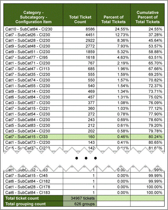
One easy and highly visible alternative to the Pareto chart is to use a Pareto table. A Pareto table houses the same data as a Pareto chart but can display several hundreds or even thousands of rows of categories. Analysts can see at a glance which items are the primary drivers and can develop improvement plans to address the most impactful culprits. The following is a real-world example of a Pareto table, using service desk ticketing data (category names modified for data protection purposes).
With the category, sub-category and configuration items combined, the Pareto table has 626 groupings. The analyst collated the three levels using a concatenate function in Excel. He then created a pivot table that tabulated the groupings that drove the most tickets. Only a few rows from the top and bottom of the table are displayed below. You can see by looking at the first few rows that the first twenty of the 626 groupings represent over 80 percent of the nearly 35,000 tickets.
7 Steps to Creating a Pareto Table
There are seven steps you need to take to create a pareto table for large data sets.
1. Collect data. Gather the data from a ticketing system, data warehouse, etc. The data may come in many formats.
2. Identify groupings/root causes to measure. The data may have a field that contains the explicit grouping to analyze. However, an analyst may wish to combine data elements to reveal more compelling aspects of the data, like the combining of category and sub-category referenced above.
3. Create a pivot table of counts by grouping/root cause.
4. Sort the pivot table from highest count to lowest.
5. Identify the total count of data items. For example, in the case of service desk tickets, the total count of data items is the total count of tickets (34,967) – each of which has a combined category, sub-category and configuration item.
6. Calculate the percent of total tickets each grouping represents. Use the following formula:
![]()
7. Calculate the cumulative percentage. This is the sum of the individual percentages from the first row in the Pareto table through the current row in the table.
Seven steps are all it takes to complete a Pareto table and get a rapid view of the most compelling drivers of your data. An analyst can perform these steps using any number of spreadsheet tools.
What a Pareto Table Tells You
Once the information is visible in this format, the Pareto table clarifies many mysteries housed in the data. Teams can quickly see which items of focus will bring the most value to the improvement efforts. For instance, in the example of the ticketing system from the table above, if teams focused on the top six items (only 1 percent of the total tickets) and made a 50 percent improvement to those six groupings they would reduce the total ticket count by over 30 percent (from 35,000 to 24,000) for future periods.
A Pareto table is an ideal tool in the Measure and Analyze phases of a Six Sigma DMAIC (Define, Measure, Analyze, Improve, Control) project as it helps teams to quickly ascertain primary drivers. It is also extremely useful in the Control phase. Teams may wish to perform a monthly Pareto analysis to ensure improvements remain. Groups may even want to write some automation to dynamically generate a Pareto table and send auto-notifications when categories are out of the desired range.
Next time you encounter large data sets with many groupings, try using a Pareto table to quickly analyze the data and see what serendipitous revelations come to light. You may be pleasantly surprised with the enigmas you unravel with this rapid data-slicing tool.