Median Charts
Preparing Median Charts
The primary reason for using medians is that it is easier to do on the shop floor because no arithmetic must be done. The person doing the charting can simply order the data and pick the center element. For simplicity, odd numbers of samples are chosen 3, 5, 7, etc. The major disadvantage of using a median chart is that it is less sensitive (powerful) in detecting process changes when extreme values occur.
Traditionally, all subgroup values are plotted, and only the median values are connected by line segments. One must be careful when interpreting the chart that the "out of control" rules are only applied to the median elements.
Steps in Constructing a Median Chart
- Either an R chart or s chart is developed as shown on the respective XBAR-r or XBAR-s charts and the process variation is shown to be in statistical control.
- If an R chart was used, the control limits are as follows:
- If an s chart was used, the control limits are as follows:
- Plot the centerline XDBLBAR, LCL, UCL, and the subgroup medians.
- Interpret the data using the following guidelines to determine if the process is in control:
![]()
![]()
Table of A(6) and A(7)

n    A(6)    A(7)       n    A(6)    A(7)
2    1.880   1.880      6    .549    .580
3    1.187   1.067      7    .509    .521
4     .796    .796      8    .434    .477
5     .691    .660      9    .412    .444

The centerline is XDBLBAR.  Note that it is the subgroup MEANS that determine both the centerline and the control limits.
a. one pount outside the 3 sigma control limits
b. eight successive points on the same side of the centerline
c. six successive points that increase or decrease
d. two out of three points that are on the same side of the centerline, both at a distance exceeding 2 sigmas from the centerline
e. four out of five points that are on the same side of the centerline, four at a distance exceeding 1 sigma from the centerline
f. using an average run length (ARL) for determining process anomolies
Example:
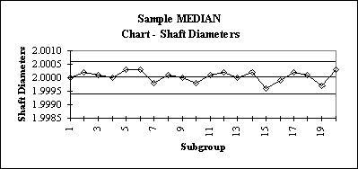
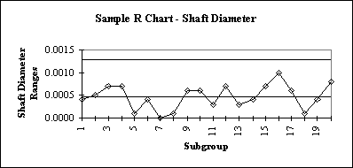
The following data consists of 20 sets of three measurements of the diameter of an engine shaft. An R-Chart will be used to examine variability followed by a Median Chart.
n       meas#1  meas#2  meas#3          Range   XBAR    Median
1       2.0000  1.9998  2.0002          0.0004  2.0000  2.0000
2       1.9998  2.0003  2.0002          0.0005  2.0001  2.0002
3       1.9998  2.0001  2.0005          0.0007  2.0001  2.0001
4       1.9997  2.0000  2.0004          0.0007  2.0000  2.0000
5       2.0003  2.0003  2.0002          0.0001  2.0003  2.0003
6       2.0004  2.0003  2.0000          0.0004  2.0002  2.0003
7       1.9998  1.9998  1.9998          0.0000  1.9998  1.9998
8       2.0000  2.0001  2.0001          0.0001  2.0001  2.0001
9       2.0005  2.0000  1.9999          0.0006  2.0001  2.0000
10      1.9995  1.9998  2.0001          0.0006  1.9998  1.9998
11      2.0002  1.9999  2.0001          0.0003  2.0001  2.0001
12      2.0002  1.9998  2.0005          0.0007  2.0002  2.0002
13      2.0000  2.0001  1.9998          0.0003  2.0000  2.0000
14      2.0000  2.0002  2.0004          0.0004  2.0002  2.0002
15      1.9994  2.0001  1.9996          0.0007  1.9997  1.9996
16      1.9999  2.0003  1.9993          0.0010  1.9998  1.9999
17      2.0002  1.9998  2.0004          0.0006  2.0001  2.0002
18      2.0000  2.0001  2.0001          0.0001  2.0001  2.0001
19      1.9997  1.9994  1.9998          0.0004  1.9996  1.9997
20      2.0003  2.0007  1.9999          0.0008  2.0003  2.0003

RBAR CHART LIMITS:
RBAR  = 0.0005

UCL   =  D(4)*RBAR   =  2.574*.0005 =   0.001287
LCL   =  D(3)*RBAR   =  0 * .0005   =   0.00

XBAR CHART LIMITS:
XDBLBAR  = 2.0000

UCL  =  XDBLBAR + A(6)*RBAR   = 2.000+1.187*.0005  = 2.0005935
LCL   = XDBLBAR - A(6)*RBAR   = 2.000-1.187*.0005  = 1.9994065
R Chart:
Median – Chart: