
People say that Six Sigma is sometimes like using a rocket ship engine in an automobile. The techniques and statistical software tools are so powerful they can lead to anomalies in the data or produce “bad” results. These include:
- Histograms that do not appear normal
- Scatter plot diagrams that do not fit a straight line
- Control charts that appear to be in control, but are not
- Control charts reflecting a process not in control, even though it is operating within limits
- Control charts with wide and highly irregular control limits
Without the benefit of extensive project experience and strong statistical interpretive skills, a Green Belt or even Black Belt may improperly diagnose these results, leading to poor decisions. Poor decisions waste time, resources and capital – specifically through re-sampling data, re-analyzing data and improving processes not in control.
Fortunately, there are some reliable, quick and cost-effective techniques that Six Sigma professionals can use in these situations to help them more properly analyze the data to make better decisions.
Histogram Anomalies
A practitioner has collected some data that represents average call-handling time for a help desk (Table 1).
| Table 1: Samples of Average Call-handling Times for Help Desk | ||||
| Minute Measurements By Operator | ||||
| Sample | Operator 1 | Operator 2 | Operator 3 | Operator 4 |
| 1 | 9 | 10 | 10 | 5 |
| 2 | 4 | 7 | 7 | 6 |
| 3 | 5 | 11 | 9 | 7 |
| 4 | 6 | 9 | 12 | 12 |
| 5 | 7 | 7 | 8 | 4 |
| 6 | 7 | 4 | 5 | 11 |
| 7 | 6 | 4 | 4 | 5 |
| 8 | 5 | 8 | 9 | 4 |
| 9 | 2 | 12 | 7 | 8 |
| 10 | 7 | 10 | 9 | 6 |
| 11 | 8 | 8 | 8 | 4 |
| 12 | 11 | 8 | 9 | 7 |
Using a statistical software package, the practitioner produced the following histogram (Figure 1).
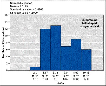
At first glance, the practitioner might conclude the data is not normally distributed. It does not have the classic bell-shaped, symmetrical curve. They may decide to collect more data or even perform another data sampling. But before going to such extremes practitioners should try calculating the measures of central tendency. In other words, determining how the data clusters or centralizes around particular values. There are three measures of central tendency:
- Mean – the sum of all the data values divided by the number of data values
- Median – the middle value when the data values are arranged in ascending or descending order
- Mode – the number that occurs most frequently in a data set
If these three values are equal or approximately the same, it is possible to conclude with a fairly high degree of confidence that the data is normally distributed. A quick calculation of the mean, median and mode in this case show they are 7.3, 7.0 and 7.0, respectively. Thus, the data is normally distributed.
Another simple but effective technique is to increase or decrease the number of classes in the histogram. In this example, reducing the class size from 6 to 5 produces the following normal histogram (Figure 2).

Sometimes practitioners will produce histograms that are skewed in either the positive or negative direction. Before jumping to conclusions and re-sampling the data, think about the type of process being measured. A positively skewed histogram could represent accounts receivables days outstanding or late deliveries, in which case a practitioner should expect the distribution to be one-sided with a tail to the right. Conversely, a negatively skewed histogram could reflect accounts payable days outstanding, where a one-sided distribution with a tail to the left could be expected.
Scatter Plot Anomalies
Simple linear regression is a great statistical tool to determine if there is a relationship between two variables. A scatter plot graphically shows this linear relationship through a straight line connecting the data points. The equation for that linear relationship can be determined as follows: Y = mx+ b, where Y is the dependent variable, m is the slope, b is the intercept and x is the independent variable.
If there is linear correlation (i.e., a straight line) it is possible to make predictions about Y given x. Correlation (r) ranges from +1 (perfect direct or positive relationship) to -1 (perfect indirect or negative relationship). Further, R2 (coefficient of determination) is the percent of variation that can be explained by the regression equation. A higher R2 value means that x is a better predictor variable of Y, and high correlation indicates a strong relationship. Taking the square root of R2 produces r.
Sometimes, however, the relationship between two variables may be represented by a curve instead of a straight line. Seeing the data is not linear, a practitioner may attempt to calculate more complex regression models such as polynomial, power or exponential functions. They might even conclude there is no strong relationship between the two variables, and, therefore, decide to select another input variable. Before going down these paths, practitioners should consider transforming the data to create a straighter line to fit the data. A simple yet highly effective approach to transforming the data into a straighter line is to square the x values and calculate new R2 values until reaching a point where the R2 is at a maximum.
Control Chart Anomalies
Control charts are powerful techniques to determine if a process is in control or out of control. Six Sigma professionals are all familiar with the general rules of control charts:
- A process in control typically contains all of its data points within the upper and lower control limits. It is stable and predictable.
- If one or more data point lies on or outside the control limits, the process is out of control (unstable, unpredictable).
Consider the control chart shown in Figure 3.

None of the data points are touching or exceeding the control limits. The process appears to be in control, in which case the Six Sigma practitioner should continue to gradually improve the process. But think again. Even though the points are within the control limits, this control chart shows a trend (six or more successive points in ascending or descending direction) that is evidence of a special cause. Consequently, the practitioner should stop, identify and eliminate any special causes before improving the process. Other examples of control charts exhibiting distinct patterns within the control limits are:
- Cycle – Variation caused by regular changes in the process inputs or methods (i.e., time of day, seasonal)
- Repeats – A pattern where every nth item is different (i.e., one station out of alignment)
- Jumps – Distinct changes from low to high values attributed to a change, such as an operator shift or different material
Here is another call center example: A practitioner is trying to assess how well calls are resolved during the first call, and they collect the data in Table 2. In this scenario, p represents the proportion of calls not resolved.
| Table 2: Call Center Data Related to First-call Resolutions | ||||
| Week | Help Desk Calls | Calls Not Resolved | p | p-bar |
| 1 | 37,374 | 4,204 | 0.01125 | 0.143744 |
| 2 | 32,612 | 3,371 | 0.01034 | 0.143744 |
| 3 | 38,972 | 4,080 | 0.1047 | 0.143744 |
| 4 | 35,045 | 3,680 | 0.1050 | 0.143744 |
| 5 | 35,411 | 3,924 | 0.1108 | 0.143744 |
| 6 | 50,938 | 5,449 | 0.1070 | 0.143744 |
| 7 | 52,970 | 5,761 | 0.1088 | 0.143744 |
| 8 | 53,408 | 6,245 | 0.1169 | 0.143744 |
| 9 | 38,581 | 4,180 | 0.1083 | 0.143744 |
| 10 | 36,863 | 5,207 | 0.1413 | 0.143744 |
| 11 | 30,810 | 6,426 | 0.2086 | 0.143744 |
| 12 | 28,677 | 4,331 | 0.1510 | 0.143744 |
| 13 | 26,214 | 5,839 | 0.2227 | 0.143744 |
| 14 | 23,776 | 4,492 | 0.1889 | 0.143744 |
| 15 | 24,335 | 4,641 | 0.1907 | 0.143744 |
| 16 | 24,311 | 4,606 | 0.1895 | 0.143744 |
| 17 | 26,863 | 4,871 | 0.1813 | 0.143744 |
| 18 | 32,052 | 5,764 | 0.1798 | 0.143744 |
| 19 | 31,026 | 5,431 | 0.1750 | 0.143744 |
| 20 | 37,191 | 6,750 | 0.1815 | 0.143744 |
| 21 | 30,109 | 5,327 | 0.1769 | 0.143744 |
From this data, a p-chart is produced (Figure 4).

The practitioner’s first reaction is that the entire process is out of control. Virtually every data point is either below or above the control limits – this should raise red flags. They might want to stop to identify and resolve all the special causes before proceeding to improve the process. Or, the pracitioner may think there are errors in the data and decide to re-perform the collection sampling. But before doing so, it is important to look again at the data to see if there are any shifts occurring. In this example, there are two distinct sets of p values: Weeks 1-9 and Weeks 10-21 (Table 3). Accordingly, two separate p-bar values are needed: 0.10896 for Weeks 1-9 and 0.18236 for Weeks 10-21.
| Table 3: Customer Calls Not Resolved, P-bar Divided into Weeks 1-9 and 10-21 | ||||
| Week | Help Desk Calls | Calls Not Resolved | p | p-bar |
| 1 | 37,374 | 4,204 | 0.01125 | 0.10896 |
| 2 | 32,612 | 3,371 | 0.01034 | 0.10896 |
| 3 | 38,972 | 4,080 | 0.1047 | 0.10896 |
| 4 | 35,045 | 3,680 | 0.1050 | 0.10896 |
| 5 | 35,411 | 3,924 | 0.1108 | 0.10896 |
| 6 | 50,938 | 5,449 | 0.1070 | 0.10896 |
| 7 | 52,970 | 5,761 | 0.1088 | 0.10896 |
| 8 | 53,408 | 6,245 | 0.1169 | 0.10896 |
| 9 | 38,581 | 4,180 | 0.1083 | 0.10896 |
| 10 | 36,863 | 5,207 | 0.1413 | 0.18236 |
| 11 | 30,810 | 6,426 | 0.2086 | 0.18236 |
| 12 | 28,677 | 4,331 | 0.1510 | 0.18236 |
| 13 | 26,214 | 5,839 | 0.2227 | 0.18236 |
| 14 | 23,776 | 4,492 | 0.1889 | 0.18236 |
| 15 | 24,335 | 4,641 | 0.1907 | 0.18236 |
| 16 | 24,311 | 4,606 | 0.1895 | 0.18236 |
| 17 | 26,863 | 4,871 | 0.1813 | 0.18236 |
| 18 | 32,052 | 5,764 | 0.1798 | 0.18236 |
| 19 | 31,026 | 5,431 | 0.1750 | 0.18236 |
| 20 | 37,191 | 6,750 | 0.1815 | 0.18236 |
| 21 | 30,109 | 5,327 | 0.1769 | 0.18236 |
The resulting p-chart (Figure 5) indicates the process is in control during Weeks 1-9. During Week 10, however, there is a process shift that significantly increases the p values. During Weeks 10-21, the average proportion of calls not resolved hovers around 18 percent. Thus, efforts to identify special causes should be focused only on what happened during Week 10 and beyond, in order to save considerable time and resources.

Another example of a strange control chart, this time involving the number of calls per customer. The practitioner collects the following data over a period of 13 weeks (Table 4), and decides to use a u-chart because there could be more than one call per person.
| Table 4: Number of Calls Per Customer | |||
| Week | Callers | Calls | u |
| 1 | 10 | 11 | 1.1 |
| 2 | 2 | 2 | 1 |
| 3 | 10 | 12 | 1.2 |
| 4 | 14 | 17 | 1.214286 |
| 5 | 9 | 13 | 1.444444 |
| 6 | 7 | 8 | 1.142857 |
| 7 | 22 | 32 | 1.454545 |
| 8 | 29 | 38 | 1.310345 |
| 9 | 139 | 186 | 1.338129 |
| 10 | 242 | 303 | 1.252066 |
| 11 | 353 | 440 | 1.246459 |
| 12 | 346 | 408 | 1.179191 |
| 13 | 327 | 396 | 1.211009 |
Figure 6 shows the resulting u-chart. While the process appears in control, the control limits during the initial eight weeks are highly irregular and quite wide. During Weeks 9-13, the control limits appear more normal (regular and narrower).

Before jumping to conclusions that the data is invalid, the practitioner should consider the type of chart they are working with. U-charts (and p-charts) are control charts for data containing defects and defectives, respectively. The control limits for these types of charts are highly sensitive to the number of samples collected. Notice the average number of samples for Weeks 1 to 8 is nearly 17 calls. The average for Weeks 9 to 13 is 347 calls. The higher the sample number, the more regular and narrow the control limits. In this example, it appears the process had not reached a “steady-state” of calls until week 9. Consequently, the practitioner might consider using only the data for Weeks 9 to 13, rather than re-sample the entire 13 weeks. Again, this can save considerable time and resources.
Making Proper Interpretations
Poor decisions waste time, resources and capital. This waste occurs in re-sampling data, collecting more data, re-analyzing data or improving a process that is not in control. Generally, the problem is not related to the tool itself, but how the results are interpreted. In the absence of extensive project experience, Six Sigma professionals can use the techniques described here to identify these anomalies and transform the data in order to make better quality decisions.