
Six Sigma DMAIC and DFSS roadmaps provide the guidance needed for using facts and data to understand problems, opportunities and solutions to get results in a wide variety of project settings. For the routine cases, they give practitioners what they need. There are some situations, though, that can benefit from a broader view of Six Sigma capabilities and tools. For example:
- Some project situations do not map neatly to the textbook DMAIC or DFSS cases. More than one new enthusiastic Black Belt starts out with a checklist-view of DMAIC or DFSS, trying to fit every project into too rigid a set and sequence of tools and artifacts. They learn pretty soon that there is a bit of art involved in seeing the nuances of any one project, and in working the ones that seem to sit somewhere in between DMAIC and DFSS. They learn to see the toolkit in a more general way.
- Organizations that really get Six Sigma recognize that its approach to making better use of better data applies to all manner of learning and decision support – some much smaller scale and others much broader than Six Sigma projects. As Six Sigma thinking moves out of the textbook and into the business and technology bloodstream, people learn to see the applicability of Six Sigma tools and capabilities in a new way.
Without taking anything away from the familiar DMAIC and DFSS roadmaps, a broader, more general view fostered by non-textbook situations is worth exploring. This fresh perspective may provide ideas for extending the leverage of the Six Sigma toolkit – in routine ways and in some new ways.
Organizing the Tools and Capabilities
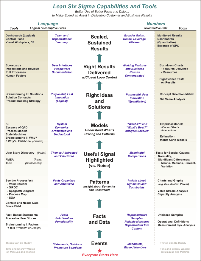
The Six Sigma Capabilities and Tools chart below is a bit daunting at first, but it illustrates a number of useful notions and it outlines the scope of this article. It is designed to be read from the bottom, where everyone starts their encounters with prospective information in the world of unfiltered events. A few things worth noticing on first review:
- The right side depicts tools that operate on numeric data – where most practitioners started their view of Six Sigma. The left side depicts tools that operate on language data, which deserves to be an equal citizen in the toolkit.
- The chart is designed to be read from the bottom, using the center to illustrate what a team or individual is accomplishing. The entry point then is where everyone starts their encounters with prospective information – unfiltered “Events.”
- Progress in DMAIC or DFSS, or in things bigger and smaller than Six Sigma projects, involves moving upward on the chart. The sun does not rise and set on pure statistics (insert slings and arrows here) – but, rather, on helping make the right use of the right kinds of data to get to the solutions and results depicted at the top. Statistics might well be used as a means to understanding value and risk along the way. In the end, the goal is understanding and capitalizing on value and risk – statisticss may well be a means to get that done.
From Events to Facts and Data
No one has to do any work to get events – they arrive with great regularity and for free. The email stating that customer satisfaction with a company’s software is down 10 percent, or the presentation stating that there are lots fewer defects since the new software development process, and so many more events vie for attention and acceptance. Six Sigma realizes that unfiltered raw experience like this can seem more compelling and believable than it should. Measurement systems analysis (MSA) provides an array of tools for seeing, segmenting and quantifying different sources of error introduced in the process of translating observations about events into what can be called “facts and data.” The statistical side of MSA helps a lot in the situations it fits, and the more general logical side of MSA helps strengthen the fact and data content in any situation. Six Sigma practitioners challenge any “event translating” process in terms of:
- Accuracy: How do the prospective facts agree with the truth? What could make them be biased?
- Repeatability: The systematic variation due to the automatic parts of the system. To what degree would the system (the automated part and the same person using it) make the same translation using the same raw observations?
- Reproducibility: The human part of the error. To what degree would the same person, playing their prescribed role in the translation system, get the same result when translating the same thing?
- Stability: What could make the system performance change over time?
- Linearity: Does system performance vary over the range of values being measured?
The MSA considerations help improve numerical data. In language data, there also is potential bias (in the form of emotion, solutions, unsupported judgment) and sampling noise. These can be addressed by using some of the tools depicted in the “language facts and data” section of the Six Sigma Capabilities and Tools chart.
Facts and Data Uncover Patterns
Facts and data are a necessary input to the pursuit of exploring patterns in data. With believable, unbiased and reasonably complete facts, project teams can look for contrasts, trends, correlations and interactions using patterns to trigger their insights. Pattern detection comes naturally to humans. People are very good at seeing “What’s different in this picture?” or “Which factors seem to be associated with (or not) changes in some measure or observation of interest?”
Graphs and charts, of course, leverage the knack for detecting patterns by organizing data in succinct ways that tease out a variety of different patterns for viewers. The table below outlines a few of the most familiar graphical tools. Sometimes the patterns themselves tell enough about what is going on – or they provoke the right “why?” questions to help a team check other patterns to get to the bottom of the causes or dynamics that connect factors (x’s) with important project result measures (Ys).
| Some Common Graphical Tools and Statistical Counterparts | ||
| Analysis Question |
Graphical Tools |
Statistical Tools |
| How is the data distributed? | By Value: Histogram, Box Plot By Count: Pareto Chart |
Normality Tests Chi-Square |
| How does data vary over time? | Run Chart (Time Series Plot) | Control Chart |
| How do changes in x’s compare and contrast to changes in Ys? |
Scatter Diagram Box Plot Multi-Vari Chart |
Variation Tests Central Tendency Tests ANOVA |
| How do x’s interact with one another? | Interaction Plot | Regression Analysis |
Separating Signal from Noise
Graphical tools help to a point, but a Six Sigma team sometimes needs to discern differences and relationships in a more refined way – making statements about their significance. That leads, of course, to the statistical tools, which pick up where the graphs leave off, separating the significant signal from chance noise. These tools, of course are Six Sigma’s strong suit.
For numerical data, the main thrust of any hypothesis test is to challenge the sample data and the prospective findings about a comparison being made based on these things:
- The sampling process itself influences the noise level in data – that can show up as bias or central tendency shift and/or variation noise. Averaging values that are gathered under an unbiased plan is the common weapon for the bias component.
- Any comparison being made should weigh the presumption that chance alone can explain any apparent differences. This is, of course, the null hypothesis.
- Any statements about the significance of a reported effect (e.g., trend, difference, relationship) should be qualified against the risk that innocent noise is being confused as a significant signal. This, of course, creates the p-value, confidence interval or critical value of the test that a team can use to show how well the data did or did not pull signal from the noise.
For language data, there is a parallel notion of separating signal from noise. A team can distill and average language data in tools like the KJ. Using the rules of abstraction, a team can distill themes and messages that are reasonably supported by lower level samples of language data.
Building Useful Models
If one thinks of a model as any construct that helps to answer questions about a system, then it can be agreed that there are many kinds of models. Some common model types include:
- First Principles
- State Machine Models
- Regression Analysis
- Design of Experiments
- Neural Networks
- Fuzzy Logic
- Monte Carlo
Six Sigma might use any of the model types listed, as they all can be used to do “what if?” analysis – predicting Y changes based on hypothetical x changes. Better yet, they can be used in the reverse direction to do “what’s best?” analysis, setting Y to a desired value and figuring the suitable settings of one or more input x’s that could result in the desired Y.
The quote “All models are wrong – some models are useful” (attributed to the noted statistician George Box) is a reminder that empirical models have to live with uncertainty and noise. Still, a useful model, viewed with appropriate caution, can provide useful insights into the dynamics of x and Y, and the operating or design choices a team has about moving a Y result where it would the result to be.
Looking Ahead: A second article discussing the upper portion of the Six Sigma Capabilities and Tools chart is forthcoming. It will consider the ways that models are used to help generate ideas, develop and select solutions, and verify and monitor the results delivered.
Acknowledgement: The author acknowledges a colleague, Tim Werner, for many helpful conversations and sketches back and forth that helped to evolve the Six Sigma Capabilities and Tools chart.