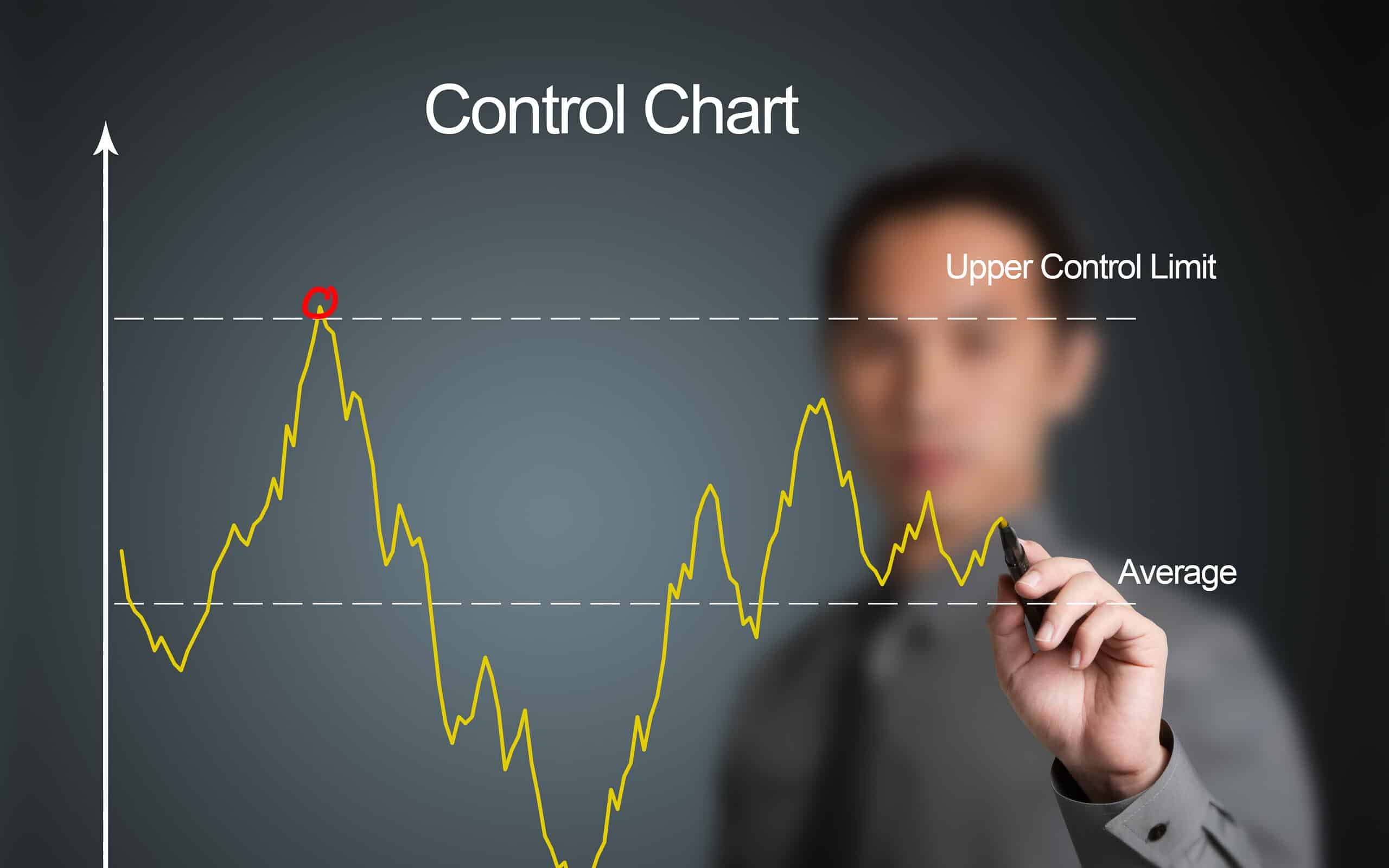
Control charts have two general uses in an improvement project.
Undeniably, the most common application is as a tool to monitor process stability and control.
A less common, although some might argue more powerful, use of control charts is as an analysis tool.
Throughout this guide, you’ll have the various control charts identified. Accordingly, you’ll also have the means to determine which best suits your needs for a given situation.
Identifying Variation
When a process is stable and in control, it displays common cause variation, variation that is inherent to the process. A process is in control when you can predict how the process will vary (within limits) in the future. If the process is unstable, the process displays special cause variation and non-random variation from external factors.
At any rate, control charts are simple, robust tools for understanding process variability.
The Four Process States
Processes fall into one of four states: 1) the ideal, 2) the threshold, 3) the brink of chaos, and 4) the state of chaos (Figure 1).3
When a process operates in the ideal state, that process is in statistical control and produces 100 percent conformance. This process has proven stability and target performance over time. Further, this process is predictable and its output meets customer expectations.
A process that is in the threshold state is in statistical control but still produces the occasional nonconformance. All in all, this type of process will produce a constant level of nonconformances and exhibit low capability. While predictable, this process does not consistently meet customer needs.
The brink of chaos state reflects a process that is not in statistical control but also is not producing defects. Accordingly, the process is unpredictable, but the outputs of the process still meet customer requirements. However, the lack of defects leads to a false sense of security. Consequently, such a process can produce nonconformances at any moment. It is only a matter of time.
The fourth process state is the state of chaos. Accordingly, the process is not in statistical control and produces unpredictable levels of nonconformance.
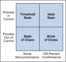
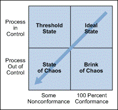
Every process falls into one of these states at any given time, but will not remain in that state. All processes will migrate toward a state of chaos. As such, companies begin some type of improvement effort when a process reaches a state of chaos. However, control charts are robust and effective tools to use as part of the strategy used to detect this natural process degradation (Figure 2).3
Elements of a Control Chart
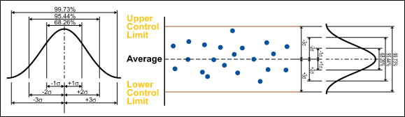
There are three main elements of a control chart as shown in Figure 3.
- A control chart begins with a time series graph.
- A central line (X) is added as a visual reference for detecting shifts or trends – this is also referred to as the process location.
- Upper and lower control limits (UCL and LCL) are computed from available data and placed equidistant from the central line. This is also referred to as process dispersion.
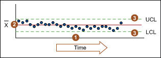
Control limits (CLs) ensure time is not wasted looking for unnecessary trouble – the goal of any process improvement practitioner should be to only take action when warranted. As such, control limits are calculated by:
- Estimating the standard deviation, σ, of the sample data
- Multiplying that number by three
- Adding (3 x σ to the average) for the UCL and subtracting (3 x σ from the average) for the LCL
As an illustration, the calculation of control limits looks like:
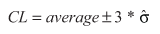
(Note: The hat over the sigma symbol indicates that this is an estimate of standard deviation, not the true population standard deviation.)
Since control limits are calculated from process data, they are independent of customer expectations or specification limits.
Control rules take advantage of the normal curve in which 68.26 percent of all data is within plus or minus one standard deviation from the average, 95.44 percent of all data is within plus or minus two standard deviations from the average, and 99.73 percent of data will be within plus or minus three standard deviations from the average. As such, data should be normally distributed (or transformed) when using control charts, or the chart may signal an unexpectedly high rate of false alarms.
Controlled Variation
Controlled variation is characterized by a stable and consistent pattern of variation over time, and is associated with common causes. Furthermore, a process operating with controlled variation has an outcome that is predictable within the bounds of the control limits.
Uncontrolled Variation
Uncontrolled variation is characterized by variation that changes over time and is associated with special causes. Subsequently, the outcomes of this process are unpredictable. Furthermore, a customer may be satisfied or unsatisfied given this unpredictability.
Please note: process control and process capability are two different things. As such, a process should be stable and in control before process capability is assessed.
Control Charts for Continuous Data
Individuals and Moving Range Chart
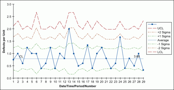
The individuals and moving range (I-MR) chart is one of the most common control charts for continuous data. It is applicable for a single data point over points in time. Above all, the I-MR control chart is two charts used in tandem (Figure 7). Together they monitor the process average as well as process variation. With x-axes that are time-based, the chart shows a history of the process.
The I chart is used to detect trends and shifts in the data, and thus in the process. As a result, the individual chart must have the data time-ordered. That is, the data must be entered in the sequence in which it was generated. If data is not correctly tracked, trends or shifts in the process may not be detected and may be incorrectly attributed to random (common cause) variation. However, there are advanced control chart analysis techniques that forego the detection of shifts and trends. Accordingly, before applying these advanced methods, the data should be plotted and analyzed in a time sequence.
The MR chart shows short-term variability in a process – an assessment of the stability of process variation. Further, the moving range is the difference between consecutive observations. It is expected that the difference between consecutive points is predictable. Accordingly, points outside the control limits indicate instability. Subsequently, if there are any out-of-control points, the special causes must be eliminated.
Example and Usage of an I-MR Chart
Once the effect of any out-of-control points is removed from the MR chart, look at the I chart. However, be sure to remove the point by correcting the process – not by simply erasing the data point.
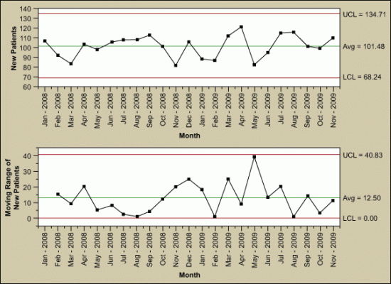
The I-MR chart is best for:
- The natural subgroup size is unknown.
- The integrity of the data prevents a clear picture of a logical subgroup.
- The data is scarce (therefore subgrouping is not yet practical).
- The natural subgroup lacks definition.
Xbar-Range Charts
Another commonly used control chart for continuous data is the Xbar and range (Xbar-R) chart (Figure 8). Like the I-MR chart, these are two charts in tandem. The Xbar-R chart can rationally collect measurements in subgroups of between two and 10 observations. Accordingly, each subgroup is a snapshot of the process at a given point in time. Further, the chart’s x-axes are time-based so the chart shows a history of the process. As such, the data must be in time order.
The Xbar chart is for determining the consistency of process averages by plotting the average of each subgroup. Furthermore, it is efficient at detecting relatively large shifts (typically plus or minus 1.5 σ or larger) in the process average.
The R chart, on the other hand, plots the ranges of each subgroup. Accordingly, the R chart can evaluate the consistency of process variation. However, look at the R chart first. Consequently, if the R chart is out of control, then the control limits on the Xbar chart are meaningless.
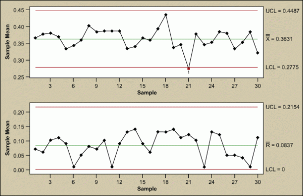
Further Examples of Xbar-Range Charts
Table 1 shows the formulas for calculating control limits. Generally, many software packages do these calculations without much user effort. (Note: For an I-MR chart, use a sample size, n, of 2.) Notice that the control limits are a function of the average range (Rbar). Further, this is the technical reason why the R chart needs to be in control before further analysis. If the range is unstable, the control limits will be inflated. In time, this could cause an errant analysis and subsequent work in the wrong area of the process.
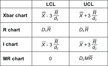
| Table 2: Constants for Calculating Control Limits | |||
|
n (Sample Size) |
d2 |
D3 |
D4 |
|
2 |
1.128 |
– |
3.268 |
|
3 |
1.693 |
– |
2.574 |
|
4 |
2.059 |
– |
2.282 |
|
5 |
2.326 |
– |
2.114 |
|
6 |
2.534 |
– |
2.004 |
|
7 |
2.704 |
0.076 |
1.924 |
|
8 |
2.847 |
0.136 |
1.864 |
|
9 |
2.970 |
0.184 |
1.816 |
|
10 |
3.078 |
0.223 |
1.777 |
|
11 |
3.173 |
0.256 |
1.744 |
|
12 |
3.258 |
0.283 |
1.717 |
|
13 |
3.336 |
0.307 |
1.693 |
|
14 |
3.407 |
0.328 |
1.672 |
|
15 |
3.472 |
0.347 |
1.653 |
Can these constants be calculated? Yes, based on d2. Where this variable is a constant depends entirely on sample size. However, you’ll have to keep track of your data points to determine if you can calculate these constants.
The I-MR and Xbar-R charts use the relationship of Rbar divided by d2 as the estimate for standard deviation. Accordingly, for sample sizes less than 10, that estimate is more accurate than the sum of squares estimate. The constant is dependent on the sample size. Subsequently, most software packages automatically change from Xbar-R to Xbar-S charts around sample sizes of 10. However, the difference between these two charts is simply the estimate of standard deviation.
Control Charts for Discrete Data
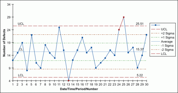
c-Chart
Used when identifying the total count of defects per unit (c) that occurred during the sampling period, the c-chart allows the practitioner to assign each sample more than one defect. Accordingly, these charts come into play when the number of samples in each sampling period is essentially the same.
u-Chart
Similar to a c-chart, the u-chart can track the total count of defects per unit (u) that occur during the sampling period and can track a sample having more than one defect. However, unlike a c-chart, a u-chart finds use when the number of samples of each sampling period may vary significantly.
np-Chart
Use an np-chart when identifying the total count of defective units (the unit may have one or more defects) with a constant sampling size.
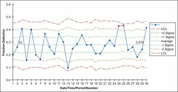
p-Chart
Used when each unit can be considered pass or fail – no matter the number of defects – a p-chart shows the number of tracked failures (np) divided by the number of total units (n).
Notice that no discrete control charts have corresponding range charts as with the variable charts. As such, the standard deviation comes from the parameter itself (p, u, or c). Therefore, a range is unnecessary.
How to Select a Control Chart
Since this article describes a plethora of control charts, there are simple questions a practitioner can ask to find the appropriate chart for any given use. Accordingly, figure 13 walks through these questions and directs the user to the appropriate chart.
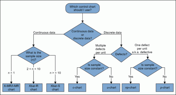
Several points come up when identifying the type of control chart to use, such as:
- Variables control charts (those that measure variation on a continuous scale) are more sensitive to change than attribute control charts (those that measure variation on a discrete scale).
- Variables charts are useful for processes such as measuring tool wear.
- Use an individual chart when few measurements are available (e.g. when they are infrequent or are particularly costly). These charts should be used when the natural subgroup is not yet known.
- A measure of defective units is found with u– and c-charts.
- In a u-chart, the defects within the unit must be independent of one another, such as with component failures on a printed circuit board or the number of defects on a billing statement.
- Use a u-chart for continuous items, such as fabric (e.g., defects per square meter of cloth).
- A c-chart is a useful alternative to a u-chart when there are a lot of possible defects on a unit, but there is only a small chance of any one defect occurring (e.g., flaws in a roll of material).
- When charting proportions, p– and np-charts are useful (e.g., compliance rates or process yields).
Subgrouping: Control Charts as a Tool for Analysis
Subgrouping is the method for using control charts as an analysis tool. Further, the concept of subgrouping is one of the most important components of the control chart method. The technique organizes data from the process to show the greatest similarity among the data in each subgroup and the greatest difference among the data in different subgroups.
However, subgrouping aims to include only common causes of variation within subgroups and to have all special causes of variation occur among subgroups. Further, when the within-group and between-group variation is made clear, the number of potential variables – that is, the number of potential sources of unacceptable variation – goes down considerably, and you can determine where to expend efforts for improvement.
Within-subgroup Variation
For each subgroup, the within variation is represented by the range.
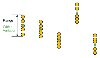
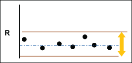
The R chart displays the change in the within-subgroup dispersion of the process and answers the question: Is the variation within subgroups consistent? As such, if the range chart is out of control, the system is not stable. Further, it tells you that you need to look for the source of the instability, such as poor measurement repeatability.
Analytically it is important because the control limits in the X chart are a function of R-bar. If the range chart is out of control then the R-bar inflates as does the control limit. This could increase the likelihood of calling between subgroup variation within subgroup variation and send you off working on the wrong area.
Within variation is consistent when the R chart – and thus the process it represents – is in control. Subsequently, the R chart must be in control to draw the Xbar chart.
Between Subgroup Variation
Between-subgroup variation is represented by the difference in subgroup averages.
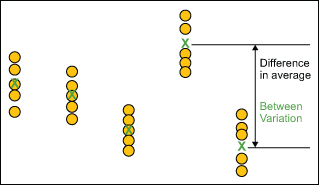
Xbar Chart, Take Two
The Xbar chart shows any changes in the average value of the process and answers the question: Is the variation between the averages of the subgroups more than the variation within the subgroup?
Subsequently, if the Xbar chart is in control, the variation “between” is lower than the variation “within.” If the Xbar chart is not in control, the variation “between” is greater than the variation “within.”
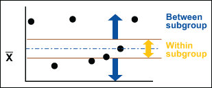
Furthermore, this is close to being a graphical analysis of variance (ANOVA). The between and within analyses provide a helpful graphical representation while also providing the ability to assess the stability that ANOVA lacks. Using this analysis along with ANOVA is a powerful combination.
Real-World Applications of Control Charts
There is no shortage of tools for collating, analyzing, and interpreting data in the domain of most businesses. So, with that in mind, what is a real-world application of control charts? Most companies will go through an audit, whether it is conducted by an external or internal team. Having data points in place for metrics allows auditors to utilize this useful tool.
In this instance, auditors would utilize control charts to monitor accounting practices throughout the year. This extends to the likes of payroll, sales, invoices, and gross sales throughout the fiscal year. With payroll in mind, it is important to consider this largely a repetitive task as a whole.
The auditor would take a look at data points like overtime, time records, and gross pay. Using a control chart, the auditor then has the means to analyze individual employees or whole departments.
Other Useful Tools for Monitoring and Analysis
While control charts serve multiple different purposes, they aren’t the only tools you’re going to be using for your data sets. Additionally, you might find they don’t paint a complete picture as a whole. If you’re looking to master all stages of a process’s workflow, acquainting yourself with DMAIC is one step. You can read more about it in our comprehensive guide.
Further, seeing how these tools work in motion is a different story compared to jargon-laden guides. See how Six Sigma has transformed a company like Avon, which isn’t one of the companies most would think of when considering data-driven analysis and customer satisfaction.
Conclusion
Knowing which control chart to use in a given situation will ensure accurate monitoring of process stability. Accordingly, it helps to reduce errors and get you back on the road to productivity, rather than wasting time.