
Key Points
- An I-MR chart is a control chart used for process stability.
- It relies on continuous data.
- They only provide a single view of your current dataset.
While some data are social creatures and get collected in subgroups. Others are more solitary and end up getting collected one at a time. When this is the case, the Individuals-Moving Range, or I-MR, Chart assesses process stability.
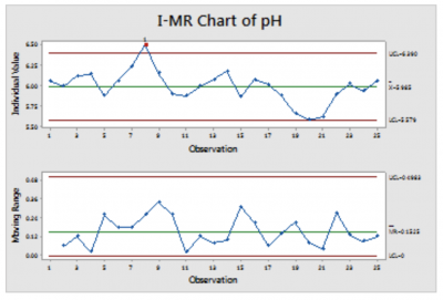
Image source: https://support.minitab.com.
What Is an I-MR Chart?
An I-MR Chart is a type of control chart that is used when the data are continuous and have been collected one at a time. It consists of two charts placed one above the other, as shown above
The top chart is known as an individual chart. The points plotted on the Individual chart are simply the data points in the dataset. They are placed across the chart in time order. The center line is the average of the data points. The control limits are placed three standard deviations away from the center line. In this case, the standard deviation is estimated using the average moving range of the data points to capture short-term variation and ideally exclude longer-term sources of variation.
The bottom chart is a Moving Range chart. The points plotted on this chart are also in time order. In this case, each represents the absolute difference between that point from the Individuals Chart and the prior point.
For example, if the first data point is 8.87 and the second is 8.54, then the first point on the Moving Range Chart, plotted in the second position, is |8.54-8.87| = 0.33. The centerline is calculated using the average moving range divided by an unbiasing constant. The control limits are set using a multiple of the average moving range.
Like all control charts, an individual chart uses one or more rules to determine when a special cause variation is likely present. The most common rule is a data point outside the control limits. Others exist, including 8 (or 9) consecutive points all on the same side of the center line.
Interpreting an I-MR Chart
If you’re new to this sort of chart, it can be difficult to get to grips with reading it. However, it is fairly basic, all things said. You have your upper and lower bounds, much like any other control chart. Further, special variation is shown on the chart through the use of flagged points. These points allow you to hone in on any potential special cause variation through your processes.
One Benefit and One Drawback
I-MR Charts are powerful for understanding the behavior of a process in which data points are collected individually. They are not flawless.
They Provide a Single View
Individual charts allow a practitioner to assess, in a single view, the stability of a process’s central tendency and variation.
They Are Sensitive to Distribution
While there is no formal distribution requirement for using these charts, data from highly skewed distributions can show higher false alarm rates on one side of the mean and an inability to detect special cause variation using the control limit on the other. This can be countered using different detection rules or transformations.
Why Are I-MR Charts Important to Understand?

©Oakland Images/Shutterstock.com
It would be difficult to execute Lean Six Sigma projects for very long without coming across a situation requiring the use of an I-MR Chart.
Subgroups Aren’t Always an Option
The best practice for creating a control chart for continuous data is to collect the data using rational subgrouping. However, many processes make rational subgrouping difficult, if not impossible, or the subgroups represent more than short-term variation. Individual Moving-Range charts accommodate this situation — when data were collected one point at a time.
Assessing Stability Is Critical
An unstable process is unpredictable. Virtually all of the statistical tools in the toolkit require a stable process to be effective.
An Industry Example
A legal department might be concerned with the time it takes to review contracts and wish to shorten it. Since contracts arrive somewhat randomly one at a time and cover different other parties and needs, there is no obvious way to create rational subgroups for data collection. Rather, each one is a standalone “part” with a cycle time to be measured.
In this situation, an Individual-Moving Range chart of the review times might be created to assess the stability of the review process. The chart would allow the project leader to see whether times are randomly scattered around some average. It also indicates whether the variation in times is stable. Conversely, it would identify if a special cause variation is likely present.
Best Practices

These charts can be used in a wide variety of situations and are quite flexible; however, there are some things to keep in mind.
Consider Distribution
While data does not need to be normally distributed to utilize an I-MR Chart, extremely skewed data can cause some undesirable behaviors, including high false-alarm rates and difficulty identifying special cause variation on one side of the centerline.
If data appears skewed, consider whether that is an indication of an out-of-control process or expected for that type of process, and if expected, consider using rules such as 8 points on the same side of the centerline, or consider a transformation of the data.
Review the MR Chart First
The control limits on the Individuals Chart are based on the short-term variation as estimated by the moving range. Thus, if the moving range is unstable, it is a poor estimate of short-term variation, and we cannot rely on the limits of the individual chart.
Use for Psuedo-Continuous Data
Often, we have data that is pseudo-continuous, such as high counts of something or a pre-calculated percentage or proportion. As long as these are generally mound-shaped in distribution – and they typically are – you can likely use an I-MR Chart to assess stability.
Other Useful Tools and Concepts
Hungry for more? Understanding how to use Microsoft Excel is just a cornerstone of life in the modern office. However, did you know you can use it for the likes of your data analysis? You’d be leaning on the function NORMSINV as well as its modern variants.
Further, understanding where your company is standing in the grand scheme of things is vitally important. The SCOT Analysis is one way you can get a top-down view of how your business is progressing while planning for the future.
Conclusion
Every continuous improvement project should include an assessment of process stability before and after changes, and the I-MR Chart is one of the most common control charts in existence. Every practitioner should be comfortable creating and interpreting one and should make consistent use of it when situations do not allow for data collection in subgroups.