
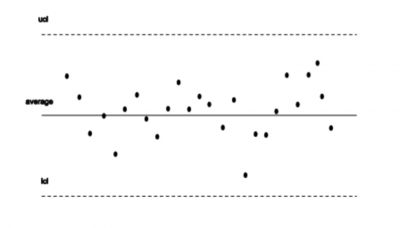
A control chart consists of several parts. It has two control limits and an average line. The bottom dashed line is called the lower control limit (LCL). The solid middle line is the average of the statistic being plotted. The top dashed line is the upper control limit (UCL).
The upper control limit is calculated from the data that is plotted on the control chart. It is placed 3 sigma (of the data being plotted) away from the average line.
The upper control limit is used to mark the point beyond which a sample value is considered a special cause of variation. It is also used to define the upper limit of the common cause variation.
Benefits of the Upper Control Limit

The UCL is based on the process data itself. Therefore, the upper control limit does the following three things.
Provides A Guide to What Is Happening in Your Process
The upper control limit is not a requirement like an upper specification limit is. Because the UCL is based on the process measure, it gives you a realistic guideline as to what to expect from the process.
Takes into Account Both the Within and Between Sample Variation
Take, for example, a control chart for the average and range. A sample consists of 5 part lengths. Both the range (highest-lowest of the part lengths) and the average length of the 5 parts are part of the UCL formula. The range represents within and the average is the between-sample variation.
Establishes (Along with the Lower Control Limit) the Predictable Limits of Variation for the Process Measure
It provides a frame for the common cause variation when the process is stable.
Why Is the UCL Important to Understand?
Control limits have been around for a long time. Walter Shewhart, a physicist at Bell Laboratories, first wrote about control limits in 1924. He developed control charts to help improve the quality of telephone equipment.
Dr. Shewhart spent years of research conducting many, many experiments to simulate various production outputs.
Based on the results of these experiments and Tchebycheff’s theorem, Dr. Shewhart decided to place control limits at +/- 3 sigma of an average (such as an average or range) to minimize the economic loss from two kinds of mistakes. (Technical note: Tchebycheff’s theorem provides statistical support for the +/- 3 sigma limits. It states that 89% of any distribution (regardless of shape, center, and spread) will fall within +/- 3 sigma.)
- Mistake 1: Calling variation a special cause of variation when it is a common cause of variation. This results in wasted time and effort, chasing non-existent special causes and/or making changes that don’t help and might hurt in unexpected ways.
- Mistake 2: Calling variation a common cause when it is a special cause variation. This results in lost opportunities. A special and fleeting source of variation in the process exists and will not be found.
Consider Dr. Shewhart’s dilemma!
If the control limits were very wide, +/- 8 sigma from the average, we would never make mistake No. 1.
If they were very narrow, let’s say, +/- 0.1 sigma from the average, we would never make mistake No. 2.
The 3-sigma limits balance the probability of making both these mistakes. It was for such reasons that Shewhart used 3-sigma limits.
An Industry Example of the UCL

In this example, a manager is using a control chart to measure the average time to answer a customer question on a helpline.
The manager collected about 20 samples of call times (three calls an hour). Further, he uses a computer program (such as Microsoft Excel) to plot the samples against the historic upper and lower control limits.
The control chart shows several call time averages to be above the upper limit. What can be said about the call time measure?
- The points above the upper control limit indicate special causes where the calls are much longer than would be expected.
- The manager should look at the process and try to understand what the source of the longer calls might be.
- If the source of the long call is found, the manager should take action so the reasons for the longer-than-expected calls can be reduced or eliminated.
The manager investigated the calls outside of the upper control limit. Accordingly, he found out they all had to do with a new customer quality issue that the workers had to research to resolve. After the correct resolution was verified, workers were trained, and subsequent call time averages no longer exceeded the upper control limit.
Best Practices When Thinking About UCL
Recall that the upper control limit is not a probability limit; it is placed at + 3 sigma because that is where it works best! The upper control limit is one key to process improvement actions.
Use the Standard UCL Formula and the Control Chart Table to Calculate the UCL
The upper control limit formula will vary depending on the statistic (average, range, proportion, count) that is being plotted. Ensure you are using the right formula!
Use the UCL to Assess if There Is a Special Cause on the High Side
If a plotted point goes beyond the upper control limit, it can be considered a special cause. This means the manager/worker should act to find the source of the special cause or respond to the control plan direction for a UCL special cause.
Use the UCL (Along with the LCL) to Evaluate the Predicted Spread of Common Cause Variation
When the process is stable, the process measure can be expected to vary randomly between the upper and lower control limits.
Other Tools for Analysis
The UCL isn’t the only thing you will use during the analysis stage of any process. Six Sigma is jam-packed with tools and concepts to make the most of your production and give you the hard numbers to back it up. With that in mind, you should consider learning about the Risk Priority Number. This handy metric lets you weigh out risks and address them as needed.
One of the cornerstones of the analysis stage is the ANOVA test. However, you might have multiple data sets to analyze as a result. With this in mind, it certainly pays to utilize Tukey’s test. This is a testing method to see if the results of your ANOVA have significant differences from the expected standard deviation.
Final Thoughts on the Upper Control Limits (UCL)
The upper control limit is one part of a control chart that allows you to identify common and special cause variations. If you understand how the upper control limit was designed to work, then you have the key to effective process improvement.