
Key Points
- DMAIC can be summarized with the Y=f(x) method.
- Y can be project outcomes, or dependent on stages of the DMAIC phases.
- X is what drives these processes and projects forward.
With its DMAIC (Define, Measure, Analyze, Improve, Control) roadmap, the Six Sigma methodology provides a structured and systematic approach to solving business and process problems. The related toolkit is a selection of proven tools and methods that– correctly applied – help to determine, analyze, and improve a problem.
All is well and good, however, inexperienced or newly trained Green Belts and Belt Belts tend to lose themselves in the application of individual tools. Each tool is used separately and sequentially rather than in the context of the overall purpose of the DMAIC approach.
In the worst case, Green Belts and Black Belts are just completing templates and do not achieve the desired outcome of a significantly improved process. An excellent way to overcome this problem is to always keep the concept of Y = f (x) in mind when applying specific tools along DMAIC phases. Here is the Y = f(x) story, phase by phase.
Y = f(x): Process Outcome a Result of Process Inputs
The mathematical term Y = f(x), which translates as simply “Y is a function of x,” illustrates the idea that the important process outcomes (Ys) are a result of the drivers (Xs) within processes. The goal of DMAIC is to identify which few process and input variables mainly influence the process output measures. Each DMAIC phase can therefore be described by how it contributes to this goal:
- Define: Understand the project Y and how to measure it.
- Measure: Prioritize potential Xs and measure Xs and Y.
- Analyze: Test x–Y relationships and verify/quantify important Xs.
- Improve: Implement solutions to improve Y and address important Xs.
- Control: Monitor important Xs and the Y over time.
Can DMAIC Be Summarized With Mathematics?
Now, I can hear you balking at this notion that a simple equation can quantify every step of the DMAIC methodology. However, when you think about it, there are noticeable outputs and data collected during each stage. As such, the Y=f(x) framework makes sense. You’re constantly getting outputs and looking at the driving forces behind each phase.
Define: Understand Project Y and How to Measure It

Many projects start with a rather unspecific and undefined business or process problem. It is obvious that something has to be done, but where exactly to start and what exactly to achieve is often only poorly described. Multiple tools are used during the Define phase to get a clear understanding of Project Y (i.e., what the process problem is in measurable terms and what the project goals are).
The project charter delivers the Y by clearly stating what the business or process problem is. It also expresses the Y as a measurable process metric that tells how well the process is performing today (the baseline) and how performance should be after process improvement (the goal). However, to reach this clear definition of the Y, the voice of the customer (VOC) and a SIPOC diagram are needed.
The voice of the customer helps to define a measurable project Y by translating unspecific customer requirements into measurable critical-to-quality elements (also known as CTQs, which is another term for the Y). In addition, VOC is used to verify the importance of the Y metric and to set specifications for the Y under consideration. The SIPOC (suppliers, inputs, process, outputs, customers) diagram links project Y to the process output. The output column of the SIPOC shows which Y is a result of the process.
Making It Fit
Since the output column usually shows multiple Ys, VOC is again needed to determine which Y should be included in the project. In the input column, the SIPOC provides a list of potential Xs.
The business case finally links Project Y to the so-called “Big Y.” This means it shows how achieving project Y contributes to higher-level business objectives like financial targets, customer satisfaction, or strategically relevant goals (on time to market, on-time delivery, inventory level, etc.). The project team can close the Define phase when it has a measurable, clearly defined Y with set specifications that help to distinguish between desired and not desired process performance.
Measure: Prioritize Potential Xs, and Measure X’s and Y
The Measure phase usually starts with a fishbone diagram and/or a detailed process mapping. Given the clearly defined Y from the Define phase, the fishbone helps to identify all potential causes (x‘s) of this Y; the detailed process mapping also shows which process x‘s mostly influence the process Y. At the end of this step, the project team should have a full picture of potential x‘s that it might next have to reduce to a manageable and measurable few. The prioritization matrix or simple multi-voting techniques help to achieve this.
It is always important to remember that brainstorming, as well as the reduction of potential x’s, happens based on process expertise, not yet on facts and data. As the next step, the team sets up a data collection plan that allows for measuring both xs and Y in such a way that the data collected can later be used to identify cause-and-effect (i.e., x-Y) relationships with the help of graphical and statistical tools. Of course, for all xs and Ys to be measured, an operational definition and – if possible – a gage R&R study should be conducted to guarantee reliable data.
Interpreting the Data
Having xs and Y data collected, the team would now start identifying patterns in data. Usually, control charts, time series plots, and frequency plots are used to separate common from special cause variations. X’s that influence special cause variation are identified, and if they can be explained and avoided in the future, they are removed from the data set.
Additionally, Pareto analyses where the Y is stratified by categories of one x help to further scope the project. The final step in the Measure phase is to determine the baseline capability of process Y: Yield, Cpk, or process sigma values indicate how well process Y is performing today. This also sometimes leads to re-setting the initially stated goals in the project charter.
The Measure phase ends with related data for the Y and the most important x‘s, where x‘s of special cause variation have already been removed from the data set.
Analyze: Test X-Y Relationships and Verify/Quantify Important X’s
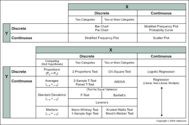
In terms of x‘s and Ys, the Analyze phase is quite simple: All graphical tools (e.g., stratified frequency plots, pie charts, scatter plots, etc.) and statistical tools (hypothesis tests, regression analysis, design of experiments) that Green Belts and Black Belts learn during training have just one goal: Verifying and quantifying x–Y relationships.
The large number of different tools available is simply because different data types (continuous or discrete) of x and Y require different tools, as illustrated in the figure below. In addition to this data door, the tools of the process door (waste analysis, value-added analysis) supplement the quantitative data analysis with more qualitative analysis and confirmation of important process x‘s.
At the end of the Analyze phase, the critical few x‘s that contribute most to the problem of process Y are known.
Improve: Implement Solutions to Improve Y, Address Important Xs
Analog to the Measure phase, the improvement phase also starts with getting a full picture. This time it is a full picture of potential solutions that – by addressing the critical few x’s – can help improve the Y. Brainstorming and creativity techniques help to generate these potential solutions.
To reduce these solutions to those that should be implemented, each solution is rated against specific criteria. Two important criteria are how much a solution contributes to improving the Y and how much it addresses specific x’s. (Of course other criteria, like easiness of implementation, costs, etc., also are important.)
Before starting the implementation of the improved process, a failure modes and effect analysis helps to identify ways that process Y can fail the potential causes (newly or previously identified x’s), and how to prevent these failures from happening.
At the end of the Improve phase, short-term data (e.g., from a pilot program) demonstrates that the identified solution or solution package has improved the Y.
Control: Monitor the Y and Important Xs Over Time

The Control phase ensures that the new performance of the Y is sustained over time. To achieve this, a process management chart is developed that shows the new process flow, offers critical checkpoints during the process, and has recommended actions in case the process does not continue on target.
In a process management chart, the previously identified x’s are called leading indicators (i.e., checkpoints during the process) and the Y is the lagging indicator (i.e., the final checkpoint at the end of a process cycle).
Additionally, a performance measurement and monitoring system or dashboard is established that helps the process owner measure and control the critical leading (x‘s) and lagging (Y) indicators on a continuous base. Control charts are again the best tool to show the performance of the Y over time.
After the handover of these tools to the process owner, the project is closed by evaluating the achieved results in terms of x‘s that were identified and the improvement in the Y.
Other Useful Tools and Concepts
Now that we’ve laid the groundwork, it’s time to consider other concepts. We’ve given a roadmap on how to approach DMAIC using the Y=f(x) framework, but understanding how to implement it in your organization is going to lay the groundwork for continued success.
Additionally, you might want to consider learning the differences between PDCA and DMAIC. While these approaches are quite similar, there are some key departures from one another. Learning how to navigate this will result in better quality across the board.