Management sits around the conference table, reviewing the most recent quality data regarding expense report rejections.
“I don’t understand,” states the director of the finance department. “We held a process improvement event regarding the non-conformances last year. It was successful! When I looked at the overall occurrences year over year, they have decreased from 108 down to 70. Why do you seem concerned about the situation?”
You pull up the Paynter chart onto the conference room screen. It’s time to demonstrate to the director why assessing the situation is more complex than just looking at the overall numbers.
Overview
A Paynter chart is a chart that combines the characteristics of a Pareto chart and a run chart. First introduced at Ford Motor Company, they are used when you want to compare multiple categories, most commonly over time.
They can assist with showing how improvement efforts have reduced or eliminated issues over time or help show when a new root cause came into play that increased non-conformances within a specific sub-group.
It also helps give a more complete picture of the state of a process, since it’s possible to have a situation where the overall numbers improve, but a category of non-conformances becomes more problematic over the same period.
An Industry Example
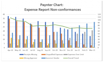
In the above example, a process improvement event addressing expense report non-conformances was held in April 2020. The major failure categories were then tracked for one year.
The Paynter chart contains lots of information to interpret. First, it demonstrates that overall non-conformances have decreased from 108 occurrences in April 2020 down to 70 in March 2021. If overall occurrences were the only metric being reviewed, the results of the event would be viewed as quite successful, with an improvement of over one-third fewer instances. But overall occurrences are not the only metric that should be considered.
The good news is that the receipts missing, unqualified expenses, and wrong approver categories have been trending downward over the year, so we can assume that the efforts of the event were both successful and maintained. Perhaps more work needs to be done for receipts missing, but there are no signs that the issues are becoming worse. The other two categories are close to zero and looking great.
Breaking it Down
What’s interesting are the other two categories, which are both significantly trending up. Incorrect vendor occurrences started a downward trend but began to increase in September 2020. This would imply that the event improvements were working, but that there was a change in September that led occurrences to rise. Was there a change in the process during this time? Did the system users stop performing the changes from the event? The trend requires more investigation to get to the root cause.
Expenses over the limit were a low occurrence at the time of the event, and they stayed constant until October 2020, when they began to rise. By March 2020, it had gone from the lowest occurrences of the major categories up to the second largest. The improvements made during the event were unlikely to negatively impact expenses over the limit, as the monthly quantities were stable for six months after the event.
So, if it wasn’t the event that led to the increases, what happened?
The Paynter Chart allows for a more detailed analysis of the situation. If management was only looking at overall occurrences, all signs would point to a great situation. With the Paynter chart, it becomes clear that the situation is not all good news. If the incorrect vendor and expenses over limit categories continue to be ignored, they are likely to continue their upward climb, and future overall occurrences will be larger.
Benefits of the Paynter Chart

Provides a Comprehensive Picture Compared to Other Metrics
Management often loves to use their KPI metrics (key performance indicators) when measuring the health of a system, but these overall metrics can be misleading. A Paynter chart helps give a more complete picture as to the health of a process and can help guide management into supporting the right process improvement initiatives.
Matches Up with the 80-20 Rule Over Time
The Paynter chart allows us to see which categories are the major categories of concern. It also shows how they change over time. Knowing whether your major offenders are minor or a regular occurrence identifies the level of priority.
It Shows How Related Categories Change
The graph does a great job of showing how a related category changes a different category. Did one group start to go up at the same time another group started to go down? Did both categories start to get worse at the same time? Are the root causes of each related?
The Paynter chart does a great job of giving suggestions as to where to look for a root cause.
Best Practices with Paynter Charts
- Always be sure that different data sources are demonstrating congruence. You want an apples-to-apples comparison on the chart regarding the data or the chart could mislead the user.
- These charts can be busy with information, so be sure to make the chart as clear to read as possible. For example, you can emphasize parts with color, eliminate any unnecessary lines, and make the titles, labels, and legend as clear and organized as possible.
- Consider adding a line or two showing any newer trends on the chart, or any graphics or notes that add emphasis to any specific point you are trying to demonstrate.
Other Useful Tools and Concepts
While we’ve discussed one useful tool at your disposal, that isn’t the only thing you can lean on. Understanding how to effectively utilize all 7 QC tools is an indispensable skill. Getting to grips with how they work and when to use them will give your problem-solving skills a much-needed boost.
Additionally, to see effective problem-solving in action, you can see how one beverage company solved a baffling mystery. Lean Six Sigma problem-solving tools are on full display with this comprehensive look back and serve as a valuable lesson for users looking to do the same at their organization.
Conclusion
Paynter charts do a wonderful job of comparing data across sub-groups, allowing you to identify trends and narrow in on the location of root causes. It’s especially great for showing comparisons between sub-groups over time and demonstrating whether continuous improvement initiatives have been successful over time.