
Key Points
- Run charts are used to check if the central tendency of a process is changing.
- They can be used for observing trends in your data over a given period.
- Creating a run chart is simple, requiring a minimum of 10 points of data for the chart.
The run chart is a powerful, simple, and easy-to-use process improvement tool. Often, the run chart is shortchanged as the statistical tests that can be used with run charts are overlooked. This article takes the reader through the benefits of a run chart as well as how to correctly create and analyze one.
Defining the Run Chart

A process is defined as a series of activities that transform a set of inputs into a specific set of outputs. Process change happens over time. Determining if a change has happened – and if that change lasts over time – is important to process improvement. A run chart is used to determine whether or not the central tendency of a process is changing.
It does not require tedious calculations or special software to produce. It plots observed values on the y-axis and the times they were observed on the x-axis. The terms time-series chart and run chart are used interchangeably. Run charts are similar in some regards to the control charts used in statistical process control, but do not show the control limits of the process. They are, therefore, simpler to produce but do not allow for the full range of analytic techniques supported by control charts.
How a Run Chart Is Used
A run chart may be used to study observed data for trends or patterns over a specified period and focus attention on vital changes in the process. The run chart is useful for tracking information and predicting trends or patterns. It can determine if a process has a common cause or special cause variation. It can also reveal whether a process is stable by looking for a consistent central tendency, variation, and randomness of the pattern. This is important because processes fall into one of four states:
- Ideal
- Threshold
- Brink of Chaos
- State of Chaos
When a process operates in the ideal state, the process has proven stability and target performance over time. This process is predictable and its output meets customer expectations. A process that is in the threshold state is predictable; however, it does not consistently meet customer needs.
The brink-of-chaos state reflects an unpredictable process, but the outputs of the process still meet customer requirements. This process can produce nonconformance at any moment – it is only a matter of time. The fourth process state is the state of chaos, which produces unpredictable levels of nonconformance.1,2
How to Create a Run Chart
There are seven steps to creating a run chart.
- Decide on the measure to be analyzed (assuming there is a reliable measurement system in place).
- Gather the data – have a minimum of 10 data points.
- Draw a graph with a vertical line and a horizontal line.
- On the vertical line or the y-axis, draw the scale relative to the variable you are measuring.
- On the horizontal line or the x-axis, draw the time or sequence scale.
- Calculate the mean/median (whichever the data set indicates to be appropriate) and draw a horizontal line at that value – going across the graph.
- Plot the data in the sequence, or the time order, in which the data was collected.
Why They Matter
You’ve likely got no shortage of problem-solving tools in your belt if you’re a seasoned professional. However, for those new to the practice, run charts provide a quick means of seeing where things might be going wrong.
While it might seem superfluous at first glance compared to other problem-solving techniques, run charts are a quick and visual way of seeing if your processes are straying from their intended goal.
How to Interpret a Run Chart
First look for runs. A run is a sequence of consecutive points which all lie on the same side of the mean/median line. Mean or median can be used depending on the data. If the data is symmetrical, use the mean; otherwise median is a better choice.
A run can be a single point if both the previous and subsequent points are on the opposite side of the mean/median line. Ignore points that lie exactly on the line. Simply count the number of runs. Having more or fewer runs than expected indicates that there is non-random variation in the process (i.e., special cause). (See table below.)
| Expected Number of Runs Above or Below the Mean/Median4 | ||
| Number of Data Points | Lower Limit # of Runs | Upper Limit # of Runs |
| 10 | 3 | 8 |
| 11 | 3 | 9 |
| 12 | 3 | 10 |
| 13 | 4 | 10 |
| 14 | 4 | 11 |
| 15 | 4 | 12 |
| 16 | 5 | 12 |
| 17 | 5 | 13 |
| 18 | 6 | 13 |
| 19 | 6 | 17 |
| 20 | 6 | 15 |
| 21 | 7 | 15 |
| 22 | 7 | 16 |
| 23 | 8 | 16 |
| 24 | 8 | 17 |
| 25 | 9 | 17 |
| 26 | 9 | 18 |
| 27 | 9 | 19 |
| 28 | 10 | 20 |
| 29 | 10 | 20 |
| 30 | 11 | 21 |
| 31 | 11 | 22 |
| 32 | 11 | 22 |
| 33 | 11 | 23 |
| 34 | 12 | 23 |
| 35 | 13 | 24 |
| 36 | 13 | 25 |
| 37 | 13 | 25 |
| 38 | 14 | 26 |
| 39 | 14 | 26 |
| 40 | 15 | 26 |
| 41 | 16 | 26 |
| 42 | 16 | 27 |
| 43 | 17 | 27 |
| 44 | 17 | 28 |
| 45 | 17 | 29 |
| 46 | 17 | 30 |
| 47 | 18 | 30 |
| 48 | 18 | 31 |
| 49 | 19 | 31 |
| 50 | 19 | 32 |
| 60 | 24 | 37 |
| 70 | 28 | 43 |
| 80 | 33 | 48 |
| 90 | 37 | 54 |
| 100 | 42 | 59 |
| 110 | 46 | 65 |
| 120 | 51 | 70 |
Interpreting the Data
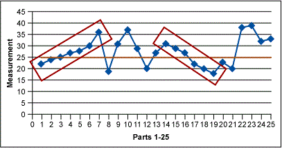
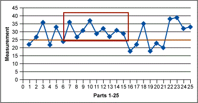
Next look for shifts. A shift is nine or more consecutive points above or below the central line. This is an indication that special cause variation exists in the process. After shifts, look for trends. Trends are six or more consecutively increasing or decreasing points indicating that special cause variation exists in the process.
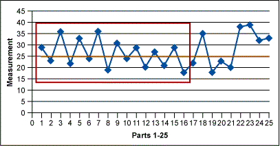
Then check for alternating points – 14 or more consecutively points alternating up and down indicates special cause variation exists in the process. Next, it is time to check for outliers, any dramatically different values indicating special cause variation in the process. In addition to these formal checks, it is important to determine if the current data looks different than the older data (if available).
Figures 1 through 3 below show some of the examples of nonrandom variation that may be found in run charts. The red boxes signal those indicators.
Pitfalls to Avoid

©Ground Picture/Shutterstock.com
The most common ways to misinterpret run charts are 1) to conclude that some trend or cycle exists, when in fact what is being seen is normal process variation (every process will show some variation), or 2) not to recognize a trend or cycle when it does exist.
People are generally less aware that they are making the first type of error; they are tampering with a process that is behaving normally.3 To avoid mistakes, use the following guidelines for successful run chart interpretation:
- Look at data representing a long enough period so that a “usual” range of variation is experienced. (This requires some process knowledge.)
- Is the recent data within the usual range of variation?
- Is there a cyclical pattern? Weekly? Monthly? Yearly?
- Draw a best-fit trend line from the beginning to the end of the data on the run chart. If the line is approximately horizontal, then the mean of the process can be considered stationary over this time interval. If not, then the process mean is considered nonstationary, or unstable. Drawing this inference requires sufficient data, usually 50 or more observations (i.e., two points are not sufficient).
The run chart is a simple and effective improvement tool. It is not a replacement for the Shewhart control charts but it is an easy-to-use tool for identifying process variation that you can add to your continuous improvement toolbox.
Other Useful Tools and Concepts
If you’re looking for additional tools to aid in your problem-solving journey, you’re in the right place. While there is no shortage of charts to use during process improvement, the p-Chart readily allows you to see when your processes are straying from conformance.
Further, having an OCAP, or Out of Control Action Plan, ready is an indispensable way to guarantee process continuity in the event of something going horribly wrong. You can learn all about it in our comprehensive guide.
References
- Wheeler, Donald J. and Chambers, David S., Understanding Statistical Process Control, SPC Press, 1992.
- Berardinelli, Carl, “A Guide to Control Charts,” iSixSigma.com, http://isixsigma.com/tools-templates/control-charts/a-guide-to-control-charts/. Accessed January 12, 2016.
- Deming, W. Edwards, Out of the Crisis, The MIT Press, 1982.
- Swed FS, Eisenhart C. Tables for testing randomness of grouping in a sequence of alternatives. Ann Math Stat 1943; 14:66-87