
Forecasting is an integral part of business management. The better the forecast, the better management will be able to plan for the future.
Although there are many methods for making forecasts, some are better suited than others for particular situations. For short-term forecasting, Black Belts can benefit from analyzing production trends and looking for special causes of variation. When making long-term forecasts, a method that uses a normal curve and Z-scores may be the better bet. Both methods are simple to apply.
Methods in Practice
The following scenario provides an understanding of how these methods work. In this example, a manufacturing manager, who was recently certified as a Black Belt, wants to use Six Sigma tools and statistical-analysis software to make predictions.
The manager tracks the department’s weekly output of pallets. Each pallet holds a constant number of cases of product and the manager uses a simple, four-week moving average in a spreadsheet. Table 1 shows a sample, from the end of a 52-week cycle, of the department’s production of pallets.
| Table 1: Pallet Production by Week | |
| Week | Pallets |
| 48 | 192 |
| 49 | 178 |
| 50 | 193 |
| 51 | 205 |
| 52 | 218 |
The manager has the two basic ingredients needed for generating any forecasts: production data and a forecasting period. The period, ordivisor, in this case is weeks. With this information, she can execute both the short-term and long-term forecasting methods.
Short Term: Looking for Trends in Moving Average Plots
Statistical software can provide Black Belts with several options for completing forecasts. In this case, for a short-term prediction, the manager chooses to plot the moving average by using a time series command. To do this, she inputs the variable and length when prompted.
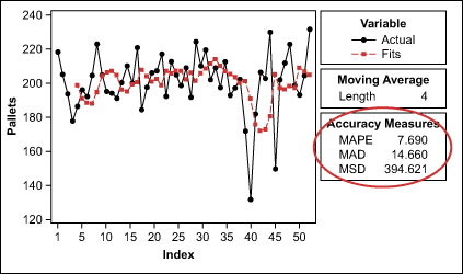
Figure 1 shows the manufacturing manager’s four-week moving average from the past year as it would appear in a software program.
Although the visual representation of the analysis is helpful, the true focus here is the accuracy measures, which represent the differences between the actual and the forecasted pallet quantities. One of these accuracy measures is mean absolute deviation (MAD). It gagues the accuracy of the fitted time series values and expresses the deviation in the same units as the data, which makes it easier to understand the amount of error. The formula for MAD:
![]()
where y is the actual value at a time, y-hat is the fitted value and n is the number of observations.
| Table 2: MAD for Various Moving Average Iterations | |
| Length of Moving Average | MAD |
| 3 weeks | 15.56 |
| 4 weeks | 14.66 |
| 5 weeks | 13.28 |
| 6 weeks | 13.72 |
| 7 weeks | 14.06 |
Because the manager is looking for a forecast with the least amount of prediction error, it is best to iterate through different lengths of the moving average in order to find lower values of MAD. Table 2, at left, shows the results for five different moving-average iterations.
The table illustrates that the manager would have a slightly more accurate forecast with a five- or six-week moving average.
When examining the graph in Figure 1, the manager may also notice that there are extreme values at points 40 and 45 and that the predicted values were essentially pulled down around these points. This should create interest for further review.
One way to the manager can conduct this review and assess the effects of the two extreme points is to place the data into an individuals control chart, as shown in Figure 2, and see if there is deviation outside of the 3-sigma control limits.
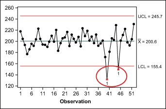
Points 40 and 45 do exceed the control limits. Of course, production output is not a single process and cannot be controlled simply by applying statistical process control, but the individuals chart is a familiar tool for Black Belts and may provide valuable insight for the manager’s forecast.
Upon review of the points outside the control limits, the manager finds a probable explanation: They occurred at two holidays, Thanksgiving and Christmas, when the department was shut down for several days. Knowing this, the manager removes the two points from the data set and reruns the moving averages to see if the MAD decreases.
The manager finds that the MAD does decrease after removing the two extreme points; the updated data is shown in Table 3.
| Table 3: MAD for Various Moving Average Iterations After Removing Outliers |
|
| Length of Moving Average | MAD |
| 3 weeks | 11.88 |
| 4 weeks | 11.63 |
| 5 weeks | 11.03 |
| 6 weeks | 11.29 |
| 7 weeks | 11.05 |
The manager can now expect better short-term forecasts using a five-week period. Operations are dynamic, however, and it would be best to review the forecast periodically and adjust as necessary.
Long Term: Using the Normal Curve
For the manager’s long-term planning, such as predicting annual output for the next year, forecasting using the normal curve and Z-scores is a better-suited method.
Because the manager is looking at probabilities using the normal curve, she first makes sure that the distribution is, in fact, normal. This can be done using the Anderson-Darling (AD) normality test. The p-value (a > .10) for the pallet production, adjusted to exclude the holiday weeks, indicates that the distribution is approximately normal.
The manager’s next step is to use the statistical software to find summary statistics, as shown in Figure 3, because they contain key forecasting components.
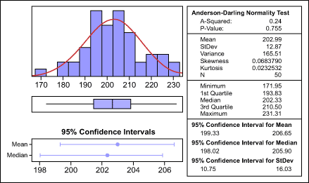
With the data gathered here, the manager can start forecasting next year’s production – assuming no significant changes are made. To begin, the manager uses a software program to create a probability distribution plot, as shown in Figure 4.
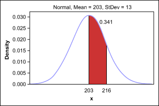
This graph shows that approximately 34 percent of production will be between the mean – 203 pallets – and 1 standard deviation (13 pallets) more than the mean, or 216 pallets.
Although this percentage can be found by using a software program, the manual calculation is almost as easy. A Black Belt can calculate the same percentage by using the Z-score and referring to a normal distribution table. In this example,
![]()
where z (number of s a value represents) = (216 – 203) / 13 = 13 / 13 = 1.
The area under the curve represents 1 (positive) standard deviation. A normal distribution table shows that a z of 1 = .841 – .500 = .341, or 34 percent.
To estimate how many weeks out of the year the department might produce at 216 pallets or more of product, or more than 1 standard deviation from the mean, the manager updates the distribution plot (Figure 5).
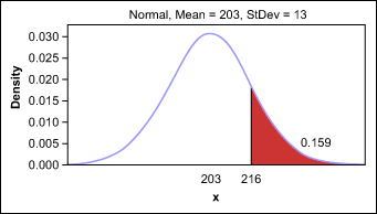
Using the above graph, the manager estimates that the department can be at 216 pallets or more for 16 percent of the year, or approximately eight of the next 52 weeks.
The manager also wants to beat the previous year’s record of manufacturing 231 pallets of product in a single week. Therefore, she sets a goal of reaching 235 pallets at least once. To figure out how many times out of the next 52 weeks the department can fill 235 pallets, the manager starts by calculating the Z-score:
z = (235 – 202) / 13 = 32 / 13 = about 2.46 s
The answer comes from looking up this Z-score in the normal distribution table or by producing another distribution graph in the software program (Figure 6).
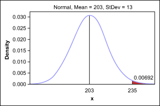
The outlook for producing 235 pallets is not good – there is less than a 1 percent chance, which means it might happen once. By using Z-scores and distribution plots, however, the manager is able to forecast these results ahead of time and set reasonable goals.