
Think about a toolbox for a moment. You have different tools for different jobs. A screwdriver makes a poor hammer, for example. Having the right tool for the right job is just the way things work. So, how do you implement the right tool for the job when streamlining your projects and processes? Thankfully, there are 7 quality control tools to get your project rolling without a hitch.
So, let’s review the 7 QC tools that are most commonly used in Six Sigma, the benefits of those tools, and some best practices for using them.
Overview: What are the 7 QC tools?
It is believed that the 7 QC tools were introduced by Kaoru Ishikawa in postwar Japan, inspired by the seven famous weapons of Benkei. Benkei was a Japanese warrior monk who armed himself with seven weapons and was on a personal quest to take 1,000 swords from samurai warriors who he believed were arrogant and unworthy.
Ishikawa was influenced by a series of lectures on statistical quality control given by Dr. W. Edwards Deming in 1950 to a group of Japanese scientists and engineers. Unfortunately, the complexity of the subject intimidated most workers. As such, Ishikawa focused primarily on a reduced set of tools that would suffice for most quality-related issues.
The 7 QC tools are:
- Check sheet
- Fishbone diagram (cause and effect diagram, or Ishikawa diagram)
- Histogram
- Pareto chart
- Control chart
- Scatter diagram
- Stratification
A Closer Look at Your 7 QC Tools
Now that you have a basic understanding of the tools at your disposal, let’s dig into how they function. Like any tool in your toolbox, understanding when you use it and where can make or break your current project.
Check Sheet
A check sheet is your most basic tool. You’re simply tallying up data for further analysis later in the process.
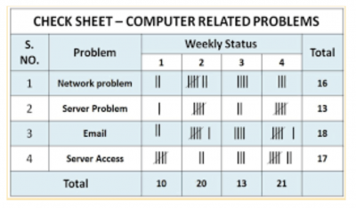
Image source: techqualitypedia.com.
Fishbone Diagram
Fishbone diagrams are used to drill down to find the root cause of a problem. As the name implies, the diagram looks like the bones of a fish, where each main bone represents a specific category of possible root cause, and the subsequent drilling down is shown as smaller and smaller bones.
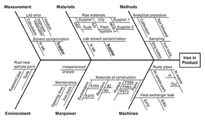
Image source: asq.org.
Histogram
This is a bar graph showing the frequency of a set of data, usually continuous data. The histogram allows you to see the center of the data, the range of the data, and the distribution of the data. It is a very useful snapshot. The downside is that you can’t see the sequence or order of the data.
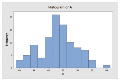
Image source: statisticsbyjim.com.
Pareto Chart
This chart is based on the 80/20 principle that says 80% of your effect is caused by 20% of your causes. For example, 80% of your sales come from 20% of your customers. Dr. Joseph Juran, who developed this chart, often referred to this principle as the vital few and trivial many. He later revised that to the vital few and useful many. The Pareto chart lists the causes in descending order of frequency or magnitude. It is used to prioritize what you should look at first to improve your process.
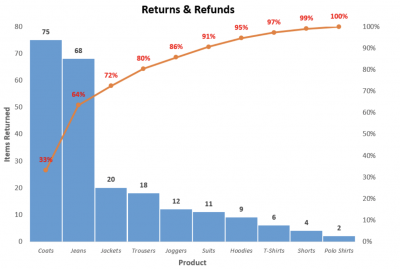
Image source: www.automateexcel.com.
Control Chart
A control chart is a statistical tool that looks at your process data over time to distinguish between special cause and common cause variation.
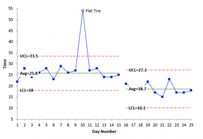
Image source: www.spcforexcel.com.
Scatter Diagram
These are also known as scatter plots. They’re used to show a graphical correlation between a set of paired data on an X and Y axis. Scatter diagrams are the graphical representation of what you would use for regression analysis.
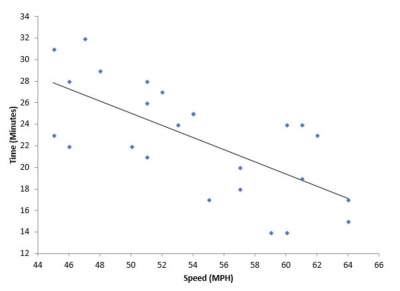
Image source: www.spcforexcel.com.
Stratification
This is a graph that shows data that has been stratified when the data comes from different sources. It is useful to view the data by certain strata such as shift, gender, geographic location, machines, or suppliers.
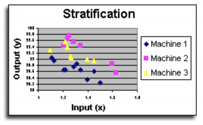
Image source: www.systems2win.com.
3 Benefits of the 7 QC Tools

These seven tools are easy to understand and apply and will help you understand what is going on in your process.
Ease of Use
These 7 QC tools are easy to understand and implement yet powerful in identifying root causes, in discriminating between types of variation, and as a visual description of your data. A picture is truly worth 10,000 words (or statistical calculations).
Flexibility and Adaptability
Gone are the days when you had to draw all of your graphs by hand. Many simple and cost-effective software packages will take your data and quickly produce graphs.
80/20
The Pareto principle applies to the 7 QC tools as well. 80% of your quality issues can be addressed by using 20% of the most common tools.
Real-World Applications of the 7 QC Tools

Imagine for just a moment you’re the manager of an MSP for the tech industry. Your organization is keeps up with the workstations, servers, and other mission-critical elements of your clients. Lately, you’ve received complaints about workstations crashing at random points in the day.
Your first step should be to create an Ishikawa Diagram. You know the problem, so what are the root causes? These workstations are in your staff’s care, so something in your workflow is going awry.
You notice that some of these machines are lacking current system updates. Subsequently, this leads to broken drivers for the network interface card. Thanks to the Ishikawa Diagram, you can map out this issue effectively.
Afterward, any team lead would develop a check sheet. You’d have criteria to make sure machines are up-to-date with their updates. Using just a handful of tools, you’ve readily solved the issue, and those mission-critical machines can stay online.
Why Are the 7 QC Tools Important to Understand?
The key thing to understand is when to use each tool. Moreover, which one is appropriate for your specific situation?
Tools Address Different Issues
The more familiar you are with these common tools, the quicker you’ll be able to select the right one to help you solve your problem or answer your question. The Fishbone diagram is used to search for the root causes of your problem. A control chart is used to distinguish between common and special cause variation. A scatter diagram is used to look for a correlation or relationship between an X and Y variable.
Graphs Don’t Tell the Whole Story
Graphs and diagrams are useful for providing an overview and directional indicator of your process. However, statistical analysis will provide greater confidence than a graph alone.
Flexibility
These seven tools can be used for different types of data and across any type of function. Their flexibility makes them useful in many situations and industries. As such, becoming familiar with them can be a wise investment.
3 Best Practices When Thinking About the 7 QC Tools

Use these tools for as many applications as is feasible. Keep it simple, and only use the more sophisticated and complex tools if you need additional information and analysis.
Have a Clear Idea of What Question You’re Trying to Answer
Since each of the tools can be used to answer different data and process questions, be sure you’ve clearly defined the question you’re trying to answer.
Use Them as Your Primary Presentation
Use the 7 QC tools and their accompanying graphs and diagrams as your primary presentation format. However, you can reserve the statistical analysis for questions that go beyond what’s answered in the graphs.
Make Sure They’re Self-explanatory
Your graphs need to be succinct and self-explanatory. People need to understand what you’re trying to tell them without the need for a long-winded explanation. You can save the details for further questions if needed.
Additional Tools and Concepts
Quality control is just one aspect of managing your projects. Implementing quality management yields impressive results, as you can see in our comprehensive guide. Additionally, this strategy can readily implement the 7 QC tools covered throughout this guide.
Keeping your team on the same page is paramount in any stage of process improvement. Learning how to implement the 5Ps in your meetings increases engagement with your employees without wasting time.
Let’s Review What’s in Your Tool Belt
The 7 QC tools are basic graphical representations of your data. They can be used to answer a wide variety of questions about your data and your process. Use them as your primary presentation format when talking about what your data is telling you. While they are not a complete list of tools, they should be robust enough to address many of your improvement issues.
While basic, these 7 QC tools are foundational elements of Six Sigma. Their simplicity and versatility make them indispensable for professionals across industries. As businesses evolve and data becomes more integral to decision-making, the importance of these tools only grows.
Further, they bridge the gap between raw data and actionable insights. This allows teams to make informed decisions. The integration of modern technologies like artificial intelligence and machine learning can also make these tools more robust, yielding richer analysis as a whole.
However, the essence remains the same: understanding and improving processes through data visualization.