
What if you were able to describe your data central tendency, variation, and shape and compare it to other processes all with one simple graph? We will describe how this can be done with a box plot.
Overview: What is a box plot?
The box plot, also referred to as a box and whiskers plot, was introduced in 1970 by Dr. John Tukey, an American mathematician and statistician.
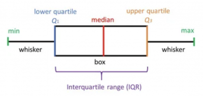
A box plot is constructed of two parts, a box and a set of whiskers as shown below. The lowest point is the minimum value of the data set and the highest point is the maximum value of the data set. The box is drawn from its first quartile (Q1) to its third quartile (Q3), with a horizontal line drawn in the middle representing the median. The plot can be either horizontal or vertical in orientation.
Here are some definitions of the elements of the box plot.
- Minimum value (min): The lowest value in the data set, excluding outliers.
- Lower Quartile (Q1): 25% of values fall below the lower or first quartile value.
- Median: The median marks the physical center of the data and is shown by the line that divides the box into two parts. Half the values are greater than or equal to this value and half are less.
- Upper Quartile (Q3): 75% of the scores fall below the upper or third quartile value. Or said another way, 25% of the data falls above this value.
- Maximum Score (max): The highest value in your data set, excluding outliers.
- Whiskers: These are lines extending from the Q1 and Q3 values to the minimum and maximum values of your data set.
- Interquartile Range (IQR): This is the range between the first and third quartiles.
In the definition of max and min above, it stated that these were the max and min values excluding outliers. What does this mean? We will use the box plot below to explain it.
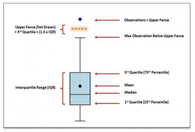
If you multiply your IQR by 1.5 and add it to the Q3 value, you will have an assumed line called the Upper Fence, which is not drawn on the box plot. Your whisker is then drawn up to the largest value falling below the Upper Fence. Similarly, a distance of 1.5 times the IQR is laid out below the Q1 value, and a whisker is drawn to the lowest value falling below the Lower Fence. Any values falling above or below the Upper and Lower Fences are plotted as outliers.
Box plots are a valuable tool in comparing different data sets.
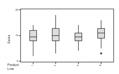
Here is a box plot of sales by product line. Here are some typical questions you might ask that can be answered by the box plot.
- Which product line had the highest median sales? Product Line 4, since the median line is the highest of the four.
- Which product line had the least variation? Product Line 3, since the height of the box or the IQR is the smallest.
- Which product line had the most variation? Product Line 2, since the width of the whiskers is the widest.
- Which product line seems to have a skewed distribution of sales? Product Line 1, since the whisker lengths are quite different.
- Were there any unexpected values for sales? Yes, there is an outlier on the low end of Product Line 4.
3 benefits of a box plot
Overall, the box plot provides a lot of information in a single easy-to-read graph. Here are some specific benefits of the box plot.
1. Visual summary of the data
The box plot shows the central tendency (median line), variation (IQR), shape (relative length of the whiskers), and outliers.
2. Easy comparison of different sets of data
When displayed on a single graph, different box plots can be compared with respect to the location of the median, amount of variation, skewness, and outliers. This allows for a quick and simple visual comparison and directional indicator. It does not substitute for a more rigorous statistical comparison.
3. A picture is worth a thousand words
Almost anyone, regardless of organizational level or education can understand and be able to answer questions about a box plot.
Why is a box plot important to understand?
As a summary graphic, understanding what the box plot is telling you about the data can serve as an initial look at central tendency, variation, and shape of the data.
It is a graph and not a statistical analysis
While the box plot is useful as a visual description of the data, it is not a rigorous analysis.
The definition of outlier in a box plot
It is important to understand that the definition of an outlier in a box plot is not a strict statistical computation. It should be interpreted as an opportunity to learn something about the process rather than an absolute determination of an unusual value.
Orientation of the box plot
Whether the box plot is drawn horizontally or vertically doesn’t matter since the interpretation will be the same.
An industry example of a box plot
The finance manager of a company was interested in the number of invoices her billing department could process in a day. Since she managed the billing department in five different locations, she had her Six Sigma Black Belt collect data for a month and then report back to her.
Below is the box plot the Black Belt used to display the data.
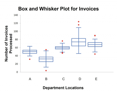
When the Black Belt was asked to interpret the graph for the finance manager, this is what he summarized:
- Location D processed the most invoices but also had the greatest variation, which made it difficult to do planning.
- Location C had the least variation.
- Location B had the lowest number of invoices processed.
- All locations had outliers.
He suggested the following actions be taken:
- Visit location D and investigate their process to understand how they are able to process so many more invoices than the other sites. Share that knowledge with the other sites, especially with Location B.
- Visit Location C to learn what they are doing to process invoices in such a consistent way and share it with Location D.
4 best practices when thinking about a box plot
It’s rare that you will be constructing a box plot by hand since many computer programs will do it for you. Here are a few things to think about if you choose to do a box plot.
1. Display the box plot vertically
Although the box plot orientation can be either vertical or horizontal, it is most common to do it vertically. This would allow your Y values to be on the vertical axis and your X categories on the horizontal axis.
2. Adequate sample size
For the box plot to be meaningful, be sure you have an adequate sample size, generally more than 20.
3. Use both average and median on the graph
Most statistical programs will allow you to put both the median and mean on the box plot. This will help with the determination of whether there might be skewness in your data.
4. Be sure to order your data high to low, or low to high
When calculating your Q1 and Q3 values, the data must be sequenced so Q1 and Q3 accurately represent the 25th and 75th percent of the data.
Frequently Asked Questions (FAQ) about a box plot
Why is 1.5IQR used to determine an outlier?
While many statisticians seek to provide a statistical explanation, the truth is Dr. John Tukey, the developer of the box plot, answered the question by saying, “Because 1 is too small and 2 is too large.”
What does a box plot tell me?
It provides a graphical description of your data by showing the median, variation, shape, quartiles, and outliers.
How do I compare multiple sets of data?
- Compare the medians or means
- Compare the interquartile ranges (box lengths), to compare variation
- Look at the overall spread (length of the whiskers)
- Look for signs of skewness and symmetry
- Look for outliers
Final thoughts for box plots
The box plot is a simple graphical representation of your data. With it, you can understand the central tendency, shape, and variation of your data along with any unusual data points or outliers.
It is a great tool for comparing different data sets. But, keep in mind it is a graphical tool and not a rigorous analytical look at your data.