
Process mapping is one of the basic quality or process improvement tools used in Lean Six Sigma. It has acquired more importance in recent times, given the complexities of processes and the need to capture and visualize knowledge that resides with the people who perform the task.
Often process mapping is looked at as an exercise in drawing some boxes and arrows and then filling up the boxes with a few words. This commonly results in process maps that run into many pages, making them very difficult to read and understand and that take too much time to modify. Some basic rules can be applied to creating process maps that make them easier to understand and use.
Since the aim here is how to make a process map look better (not how to create one), the explanation of the standard notations to be used for creating a process map and the different ways in which a process map can be used are not discussed in detail.
However, a few standard notations are indicated for context. Also, the assumption is that PowerPoint is being used for process mapping. Most of the tips discussed could easily be translated into other software such as Visio. The reader needs only to understand the spirit of these recommendations.
Basic Symbols to Be Used
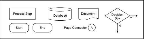
Most of the standards use the symbols in Figure 1 to create a process map. The start and end symbols indicate the start and end points on the map. Rectangular boxes are used to indicate process steps and diamonds are used for decisions.
Decisions usually have two branches – one for yes and another for no, indicated by Y and N respectively. Circles with a letter or letters are used as page connectors, i.e., if a process spills over onto another page, then a page connector is connected to the last process step on the first page and the first process step on the next page with the same letter. Database and physical documents are indicated as shown.
Selecting Better Connecting Arrows
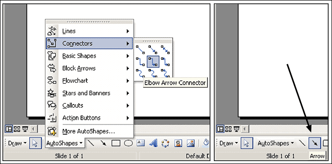
The first step in drawing a process map is to select a connecting arrow to connect the boxes (process steps) and diamonds (decision boxes). For connecting boxes, use elbow arrow connectors (Figure 2). These can be found in the AutoShapes tab in the drawing toolbar at the bottom of the PowerPoint application.
If the drawing toolbar is not visible, it can be made visible by selecting View > Toolbars > Drawing. An inefficient way to connect the boxes and one of the most common mistakes is to use simple arrows available in the same drawing toolbar. The advantage of using an elbow arrow connector over a simple arrow is that the simple arrows do not redraw themselves as the boxes are moved around, whereas elbow arrow connectors do.
Drawing Better Text Boxes
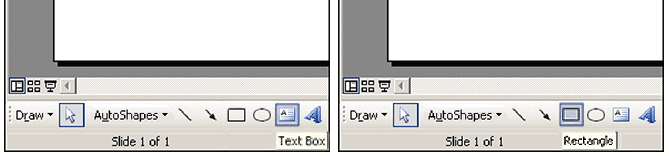
The boxes are drawn using the text box tool (Figure 3). The most common pitfall in drawing boxes is to pick up a rectangle and insert a text box without a border. It is better to use the text box with a border or a rectangle without the text box.
Good results can be achieved by choosing Arial as the font and 10 points as the font size. Also, ensure that word wrapping is on (Word Wrap Text in AutoShapes is checked on the tab of Text Box within the format Text Box Option). All four internal margin settings should be set to zero on the same tab. These settings are applicable for diamonds (decision boxes) as well.
Use crisp language, especially on diamonds, which usually take up more space than text boxes. For example: “Is customer caught in the sanctions list?” can be worded as “Customer in the sanctions list?”
Move additional lines of text that describe the process step in more detail to a footnote. This will help reduce the number of letters within the text box or diamond, making it easier to reduce its size. The objective is to reduce the percentage of the paper area that is printed. The fewer print impressions, the more readable the page.
Improving the Layout of the Page
Try to keep the text box size the same across the slide and align all of them (through imaginary lanes both horizontal and vertical). To achieve this, the check box on the tab named Text Box with a heading of Resize AutoShapes to fit text has to be unchecked.
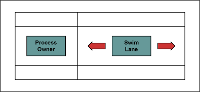
This will enable increasing or decreasing the size of the text box irrespective of the text inside. Center items within the “swim lanes.” A swim lane is usually the banded area that runs horizontally across a process map (Figure 4).
It is used to denote the area of responsibility for a particular role/department(i.e., all the process steps within a swim lane are owned and performed by that particular role or department). Try to keep closer to those swim lanes that have the greatest number of interactions with each other.
Avoid using the names of individuals on process maps. People may come and go; roles remain longer. Hence, always use roles or the names of the departments that perform the process step rather than the name of a person.
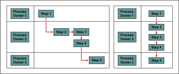
Try to place the text boxes in such a way that the length of the connectors is minimized, i.e., move the boxes as close to each other as possible. Also, ensure that the space between boxes is as uniform as possible (Figure 5).
Care Required with Use of Connectors
Ensure that the connectors are connected with the text boxes or diamonds. This can be verified by clicking on the connector itself. If the end of a connector is colored red, it means that the end is connected. On the other hand, if it is colored green, that is an indication that the end is not connected but is hanging loose. Ensuring that the connection is made is an important aspect of using a connector.
Never crisscross connectors as this will make the process map much less readable. Even if using Visio, which gives a provision to add a bend-over feature to facilitate crisscrossing connectors, avoid them as much as possible.
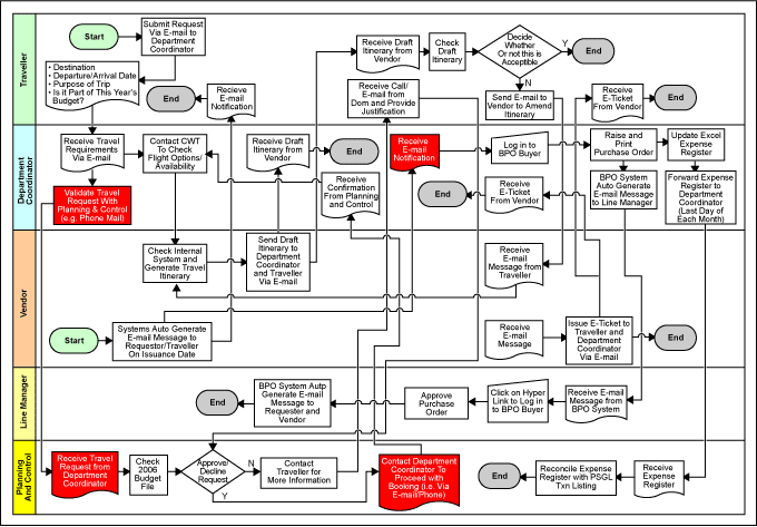
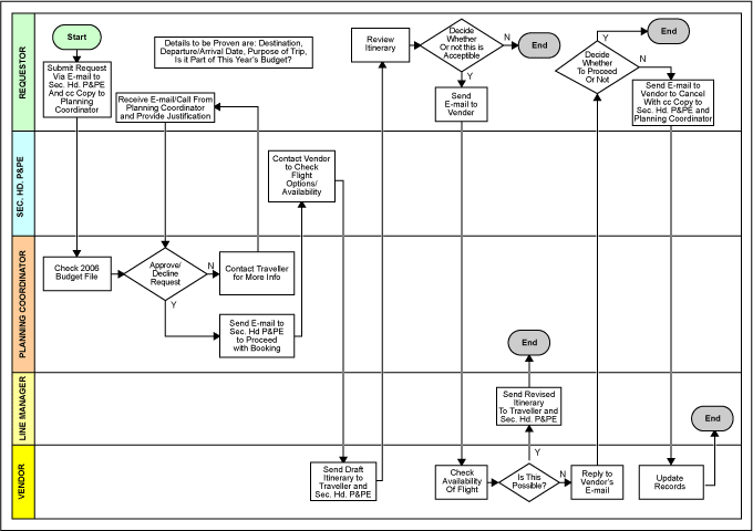
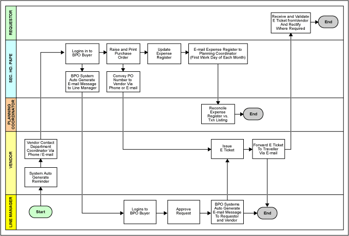
Crisscrossing makes the process map look like a bowl of spaghetti (Figure 6). Split the process map into two pages if necessary. A simplified version of the process map in Figure 6 is illustrated in Figures 7 and 8.
Try to reduce the number of bends (elbows) on connectors. If there is a need to make very small movements to straighten a connector line, first select the text box that needs to be moved and then press the control key and hold it. Now use the arrow keys to move the text box. This will help move the text box a smaller distance than the normal movement using arrow keys.
Ensure that the direction of the connectors is always either to the right, down, or up. Avoid connectors that move backward or to the left.
Interchange the direction of Y or N on decision boxes to choose the best route, avoid crisscrossing connectors, or reduce the length of the connectors.
Numbering Conventions Recommended
It often helps to number the process maps and process steps. A good system to use is this numbering convention:
- Level 1: Process 1.0, Process 2.0, Process 3.0, etc.
- Level 2: Sub-Process 1.1, Sub-Process 1.2 …. Sub-Process 2.1, Sub-Process 2.2,
Sub-Process 2.3 …. Sub-Process 3.1, Sub-Process 3.2 … etc. - Level 3: Sub-Process 1.1.1, Sub-Process 1.1.2, Sub-process 1.1.3 …
Sub-Process 2.1.1, Sub-Process 2.1.2… etc. - And so on…
Tips/Techniques for Advanced Users
One idea to better use space is to use the zigzag movement. This tip is somewhat contrary to the idea of reducing the amount of printing on a page. However, the idea is to reduce the number of pages or otherwise simplify the maps when the number of process steps is many and spills over to numerous pages. In such cases, the use of the zigzag layout becomes a real option (Figure 9).
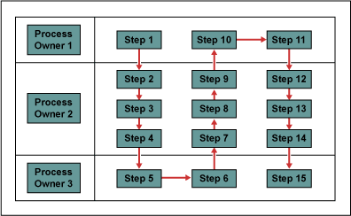
Another idea is to try to have all connectors joining a text box at the same point. This will help reduce the total length of connectors on a page.
Always assume that the X-axis depicts time. This will help arrange process steps that happen one after the other in time. Ensure that the text boxes of process steps done one after the other in time are not aligned together vertically but placed adjacent to one another.
Other Useful Tools and Concepts
Process mapping is only part of the equation when looking at how to effectively communicate your current workflow. Understanding the I-P-O model is a great way to simplify your processes and show your team how things function.
Further, you might want to take a look at how value stream mapping works in the real world. We’ve got a post-mortem that covers how a university used it to greatly increase its number of MBA applicants.
Conclusion: A Final, Over-arching Tip
These guidelines, developed through practical experience, should help achieve better mapping results. A final, over-arching tip: One should be willing to start from scratch and redraw the whole process map to make it easier to serve its purpose.