
Three years into the Lean Six Sigma deployment at Ball Corporation (the company known for its glass canning jars), the process improvement team began a visual factory initiative. This initiative was intended to develop visual signs on plant floors that not only instruct employees about where to focus their energies, but also depict the health of the company. These visual cues would be the driving force behind Yellow, Green and Black Belt projects. They should not only point to improvement opportunities but also highlight the success of completed improvements. Armed with an idea to build the ultimate dashboard, the team began.
Step 1: Ask Questions
Some questions that were asked and heard:
- What should the dashboard look like?
- How many metrics should the dashboard have?
- How can the data be presented in a way that can be easily tailored to different levels in the organization?
- Who will use the dashboard?
Step 2: Tool Selection
Lean is not about spending a lot of time and money implementing new systems. It is fine to begin with a manual dashboard. Design metrics and update them on a whiteboard once a day. It is the impact of the metrics that Ball was striving for, not the flash of a fancy product. Ball already used a reporting system from Cyberscience; as the system included a dashboard tool, the Cyberscience dashboard was selected for use.
Step 3: Dashboard Design Basics
An effective dashboard should:
- Be viewed on a single one-page display screen (no scrolling required).
- Feature three to seven metrics.
- Present data that is as close to real-time as possible.
- Include metrics that can be affected by one of the target audiences.
- Be simple and easy to read with minimal text.
- Eliminate the need for paper reports.
An effective dashboard should not:
- Be everything to everyone.
- Have more than seven metrics.
- Require scrolling to view the main metrics.
- Contain a lot of text.
- Remove the need for detail reports.
Step 4: Determine the Audience
The team started to jump into developing the dashboard by defining the metrics, but quickly realized that the audience must be defined first. Who should be acting on the dashboard data? For Ball, it was determined that the biggest benefit of visible metrics would be on the manufacturing floor. The manufacturing floor employees would be able to use the dashboard data to drive and realize improvements on the production lines.
Step 5: Develop the Metrics
With the target audience in mind, the next step was to define the three to seven metrics that would be best suited for driving improvements on the manufacturing floor. Several brainstorming sessions on this topic led to the following suggestions of different types of metrics and their frequencies.
Metric types
- Safety
- Inventory dollars
- Defective product quantities or dollars
- Sales quantities or dollars
- Line efficiency (as compared to standard)
- Maintenance and repair spending
- Line spoilage costs
- Defective material spoilage costs
- Schedule attainment
- Customer complaints created or closed
- Manufacturing downtime
Frequency and detail level
- Production day
- Week
- Month
- Year-to-date
- Crew
The options were evaluated over a period of weeks with staff at various management levels at both corporate- and plant-level. The final metrics list follows:
- Safety
- Defective material produced and held (dollars)
- Inventory (dollars)
- Line spoilage (percentage)
- Line efficiency (percentage)
- Customer complaints (number)
- Maintenance and repair costs (dollars)
The frequency chosen for the main dashboard page was “period-to-date,” in this case, month-to-date. Agreement on this was more difficult to come by than the metrics themselves. Ball has 11 plants and there were many ideas on how metrics should be used for operations decisions – for example, some plants wanted to use metrics by crew, some wanted to look at the metrics by production day (defined as the last 24 hours) and some wanted to look at the metrics by week. In the end, the team confirmed that the metrics needed to drive improvement opportunities, not firefighting reactions. For this reason, month-to-date was the optimal frequency for the metrics. Beyond that, it is expected that once an improvement opportunity is identified, whichever team is working on the improvement will run detailed reports as needed to support the improvement effort.
In addition to period-to-date, the main dashboard page was also include line charts for rolling 12 months, 13 weeks and 30 days.
Step 6: Determine the Levels of Data
The next step was to determine what levels of data were required, which meant returning to the intended audience. Here, the dashboard was being created primarily to drive improvement projects on the manufacturing floor. At the end of the day, the data must be understood by the employees on those plant floors or the dashboard is doomed to fail.
To make this exercise more challenging, there are multiple plants, which each have their own departments and each department then has multiple manufacturing lines. The metrics must have drill-down capability to the line level in order to drive the correct actions on the manufacturing floor.
The dashboard, however, must also have the ability to be viewed – in helpful measures – at various management levels. For example, a department manager will want to see the data at the department level. Likewise, the plant manager will want to look at data aggregated to the plant level. A corporate leader may want to see the data at the division level but still have the option to drill down to view metrics at individual plants.
Fortunately for Ball, the Cyberscience dashboard allows users to manage many levels of data. When implementing a manual dashboard, start with the level of metric that will be acted on or affected by the main audience – in this case, that is the line-level data.
Step 7: Designing the Display – Visual Management
A basic metric format was designed that could display any type of data.
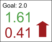
The goal is labeled and displayed at the top of the individual metric box. The number in the middle (1.61) is the period-to-date value. Here, it is green because it is better than the goal. The number at the bottom (0.41) is the variance to the last period. Here, it is red and there is a red arrow pointing up because while this process is outperforming the goal, it is not doing as well as it did during the prior period. With little more than a glance, someone can easily see if there is an improvement opportunity. It is that simple.
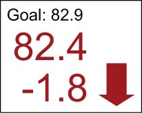
Figure 2 is an example of a metric that may spur a Lean Six Sigma project to improve it. In this metric, the process is performing below the goal and is trending down from the prior period.
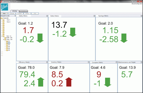
The dashboard application was selected, seven metrics identified, metric formats selected, levels of metrics defined. What comes next? Put it all together and the result is a dashboard complete with views available from corporate down to the lines at each plant – displaying the same seven metrics for each level. Figure 3 shows the full dashboard for one line at one plant.
It bears repeating that if a company is implementing a manual dashboard, the goals must be to 1) keep it simple and 2) to use data that can be acted upon by the intended audience.
Step 8: Delivering the Dashboard
The dashboard is done now, right? Wrong. In some ways, creating the dashboard is the easy part. One of the harder tasks in this process is determining how best to deliver the dashboard. The process improvement team wanted the dashboard to be visible, interactive and available for many people to view. Options for displays included tablets, large displays, individual workstations, terminals, etc. For Ball, the selection ended up being a dashboard at every plant on a large touchscreen display. Not only are the dashboards visible but they are also perfect for driving “department huddles,” quick 15-minute kickoff meetings to discuss the state of things from a production standpoint.
Step 9: Training
Because the dashboard displays metrics that are simple to understand, webinars were used as the main training method. With 13 plants located all over North America, Ball found webinars ideal for training multiple people in multiple locations. The team also created a short training guide that was available to everyone. In addition, process improvement team members did some one-on-one phone follow-ups to help users become more comfortable with the tool.
Training was fairly easy, but the adoption of the dashboard proved more complex. The team continues to look for additional ways to enhance the adoption of the dashboard. One of those ways that is being promoted is the department huddle, a quick stand-up meeting for managers and team members to discuss how to address priorities as indicated by the dashboard.
Step 10: Feedback
Feedback is good, but be careful. Initially some of the feedback Ball received was trying, in effect, to make the dashboard all things to everyone. That is not the intent of a dashboard. (Now is a good time to go back and reread the section on dashboard design basics in Step 3.) A dashboard will not replace all detailed reports. Those reports will continue to be needed, but with luck they will only be used to better understand the item that is being targeted for improvement. (For Ball, for example, that may be related a specific production line.)
Based on that feedback, the team did add a year-to-date tab and is working on a tab that will show some values for the prior production day. The method for calculating the spoilage metric also changed. Ball did not, however, add any additional metrics to the main page – it still abides by the rules laid out in the dashboard design basics.