Engineers, Six Sigma practitioners and other researchers often work with “hard” data – discrete data that can be counted and legitimately expressed as ratios. But what of “soft” data, things like opinions, attitudes and satisfaction? Can statistical process controls (SPC) be applied here? Can process variation in customer satisfaction, for example, be measured and then reported to management in a meaningful way? Can we leverage “appeal,” “responsiveness” or “value for money spent”?
In Visual Explanations, Edward Tufte demonstrates how the NASA Challenger disaster may have been avoided if the Morton Thiokol engineers had displayed their temperature vs. o-ring failure data in a meaningful way. They had all the data they needed – but it did not get translated into information. In a similar fashion, a well-designed survey or comment card will gather a wealth of data. The process of turning soft data into information (assuming the data are valid) is two-fold: knowing what to extract and knowing how to display.
Information Extraction
Visual Inspection and Intuitive Statistics
Visual inspection of data is paramount to understanding it. Raw data, midpoints, ranges, and frequency distributions need to be examined visually before feeding it to a computer for advanced analyses. The need for complete familiarity with the distribution cannot be over stated. Two aspects of data that must be inspected are magnitude and consistency: How much and how many? Inspection will reveal outliers and provide relatively accurate estimations of the median, mean and standard deviation (this requires a bit of practice). The shape of the distribution will indicate if there is a problem with normality.
Data consistency, often overlooked, should also be examined. Consider the situation of an experiment with six sub-comparisons, each one insignificant, but with all six differences pointing in the same direction. The researcher concludes no differences, but six consistent events yields a probability of .016, a rare event in its own right. No matter how good the statistical software, there is no substitute for human intervention at the right point. The foregoing is meant to help the researcher get a “feel” for the data, since a lack of understanding of the data will be easily transmitted to decision makers.
Leverage
Computer-calculated means and variances should be confirmatory at this point, assuming you have at least interval level data (data are rank-ordered, and have equal intervals between the numbers). We can now consider the item means (from a survey, for example) as performance indicators of small, individual processes. The means tell us how well each item is performing. But how do we know which processes are important and which are irrelevant?
In a well-constructed survey, there will always be one item which captures the overall meaning of the survey results: In an employee satisfaction survey, for example, it might be “I like my job” or “I like working here.” All items on the survey should be pointing, somehow, to this bottom line. If we run correlations of each survey item with the bottom line, satisfaction in this example, we can see how well (or poorly) each item relates to satisfaction.
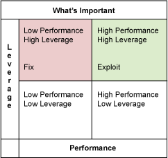
This is leverage: the correlations reveal which items make a difference, and by how much, to overall satisfaction. We can see which items need to be “leveraged”. By plotting a two by two table of Performance vs. Leverage (means vs. correlations), we can see where to focus first in order to 1) fix problems and 2) exploit what we do best. (See Table 1.) Caveat: Correlation does not mean causation, it only means a relationship exists. There may be an intervening variable that is responsible for causation. A root cause analysis, starting with the low performance, high leverage items, should be conducted, after examining process variation (see below).
Process Variation
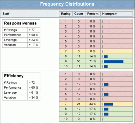
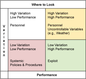
But what of the variation in these item processes? The coefficient of variation (Cv: the item mean divided by its standard deviation) provides an indicator of process variation for our soft data. It provides information regarding control and consistency. Some items, by their nature, will suggest where to start looking for root causes of problems, but not all. Looking at performance versus process variation may hold a clue for these items. Knowing that, in general, policies and procedures are static and consistent, and that people are dynamic and inconsistent, we can make an initial stab at where to focus on fixing some problems. Consistently low performance suggests a systemic problem, which in turn suggests that policies, procedures, methods, etc., may be a root cause. Any inconsistent (high Cv) performance suggests that people are influencing the variation: training, supervision/leadership, working conditions, etc., are some areas to consider for your fishbone diagram. By plotting the Cv versus performance (means) in a two by two table, the results identify consistently high performance items, consistently low performance items, etc. We now have performance and process variation data charted in a meaningful way (see Table 2). To see the relationship of the Cv to the frequency distribution graphically, see Table 3. This is intuitive.
Actionable Information
Making Data Understandable
Displaying technically derived data (means, variances, correlations) to decision makers will require explanations that may overshadow and obscure the actual information to be conveyed. For example, explaining that there is a statistically significant difference between a mean of 5.84 and 5.43 on a 7-point survey scale will not promote your mission or your conclusions.
Consider converting everything to percentages: this allows easy comparison across all items, as well as quick evaluation of each item. The numbers above convert to 83 percent and 78 percent, respectively. Everyone can quickly see and evaluate a difference of 5 percent with minimal explanation. The leverage data, currently in the form of correlations, should be converted to shared variance: square the correlation and multiply by 100. The display of an item with 60 percent leverage versus one with 30 percent makes technical explanations unnecessary – the boss can see which one is more important and by how much, and has a good understanding of why. Next, convert the Cv (standard deviation/mean) to a percentage by multiplying by 100. The only explanation required here is “lower is better” (Six Sigma standards will rarely apply to soft data). The beauty of these conversions is that the information contained in the data has not been lost or altered: information integrity remains intact, but now it is understandable at a glance.
The (Almost) Holy Grail
We now have information that is approaching action ability: performance, leverage, and process variation expressed in a recognizable format. If your survey has been well designed, you will also have collected some demographic data (it does not take much). Sort performance, leverage and variation by the demographic data – the derived information will change with each sort, specific to each demographic. We now have target groups.
Using the two by two tables we can demonstrate, by target group, which items are important, in control, performing well, and should be exploited: this is what we do best, capitalize on it. We can also identify which items need to be fixed, and in order of priority. Some items, by their nature, will suggest where to start looking for root causes, but not all. The performance versus process variation table may hold a clue for these items. Knowing that, in general, policies and procedures are static and consistent and that people are dynamic and inconsistent, we can make an initial stab at where to focus on fixing some problems. Consistently low performance suggests a systemic problem, which in turn suggests that policies, procedures, methods, etc., may be a root cause. Any inconsistent (high Cv) performance suggests that people are influencing the variation: training, supervision/leadership, working conditions, etc., are some areas to consider for your fishbone diagram.
Your committee, boss and CEO now have rich information regarding what to exploit, what to fix, and where to look. A question that often arises at this point is, “Anyone have any ideas on how to do this?” If the survey was well designed, it solicited comments in such a way that it greatly increased the chances of garnering actionable ideas: “Give us ONE good idea on how we can improve xxxx.” This is a simple and focused task, rather than a vague request, and tends to elicit actionable responses. Review all comments (data inspection). Review them again, this time looking for themes. Group the comments by theme. Your customers, employees, constituents, etc., can generate a smorgasbord of ideas. Enjoy the buffet.
Once you have a feel for your data, you can run these (relatively) simple analyses and comparisons and display clear and powerful information that provide road maps for action.